
Don’t Forget Your Greens
I’ve been testing ink colors for some time. I actually wrote only with black ink until a little over a year ago when I had a contract in a department of a company that color-coded signoffs in their workflow. The department I was working in had green for our color and we were all given horrible green ballpoints so that we could sign our parts and approvals. Actually, it was a pretty good system; the workflow sheets were intuitive and easy to interpret at a glance. I don’t remember when or why I bought it, but I had a bottle of Waterman Green in the studio. So I loaded up my Rotring Initial with Waterman Green and brought it into the office.
I liked writing with green ink. It’s distinctive and eye-catching. Problem is, the Waterman Green is maybe a bit too eye-catching. It’s a bright emerald green, which was fine for filling out the workflow sheets, but I wanted something darker and more dignified, perhaps a green similar in value but not hue to the blue ink many people write with.
I started looking for Noodler’s Hunter Green, which is one of their «bulletproof» inks, but I found a bottle of Private Reserve Sherwood Green first. Eventually I also found the Hunter, but in the meantime I heard about a green that really sounded like it would fill the bill: Noodler’s Zhivago. Zhivago is a green-black that Noodler’s calls «near-bulletproof».
There are a lot of other greens out there, but those are the ones I’ve tried. Additionally, I experimented with mixing PR Sherwood with two other Private Reserve inks, Velvet Black and Grey Flannel, to generate a more neutral gray-green.
The following scan is a comparison of those five greens. Each has a series of lines followed by a swash laid down with a brush.
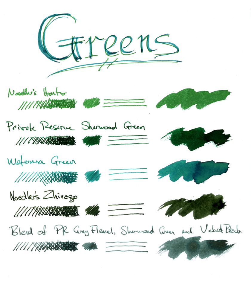
You should not trust the scan for accuracy. On my screen it comes off a little bluer than the original, but who knows how the color balances on your screen.
Noodler’s Hunter Green, as you can see, is even brighter than Waterman. I wrote with it for a few days but it never really found its way into rotation. Like many Noodler’s inks it can take a while to dry, although I haven’t had that issue with Zhivago.
I liked PR Sherwood quite a bit. At the same time, I picked up a bottle of PR Grey Flannel. I did not like Grey Flannel very much, but I thought that it would be interesting to see something with similar value and a greenish hue. Since I didn’t like the Grey Flannel anyhow, I sacrificed it for mixing.
Other than blacks and browns of course, I’ve been writing with the
Zhivago for a few months. I thought it was what I’d been looking for, but the more I’ve written with it, the more I’ve had a nagging bad feeling about it. On off-white or ivory paper like the paper in Moleskine notebooks or Crane’s Pearl White, the Zhivago comes off as cold and almost sickly. Putting down the colors in this comparison made it clear to me, even on white Clairefontaine Triomphe paper. It’s an olive shade so dark it approaches black and has very little warmth to it. It’s an interesting and impressive color, but I’m growing less interested in it as a color to write with.
On the whole, I’ve grown to like the PR Sherwood best. It’s warm, rich and dark green. It’s dignified and suggests growth and life. Zhivago is darker, but suggests disease and toxicity.
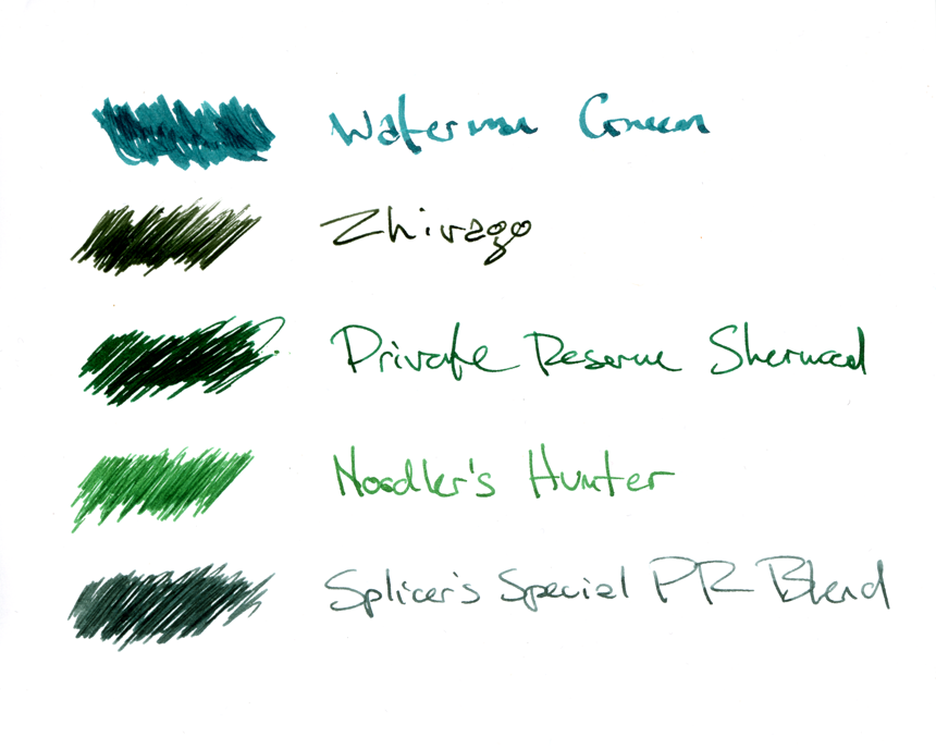
One of the selling points of Noodler’s is its resistance to water and chemical attempts to remove the marks made with it. So just for kicks I thought I’d take a look at how the other inks would stand up, and how the «near-bulletproof» Zhivago would stand up.
My original plan was to take the sample sheet and boil it for an hour, but it soon became clear that the paper was not going to survive being boiled, so I stopped and removed the paper after five minutes in the pot of boiling water. My apologies that the samples for boiling were not in the same order as the earlier scan.
The results were obvious before I got to boiling the paper. Dipping the sheet in water for five seconds washed away a large part of the ink. Fountain pen inks are water-based; ones that aren’t have a bad tendency to clog and corrode pens. So most of the pigments in most fountain pen inks will dissolve when wet. I could describe how Noodler’s makes their water-based inks waterproof but you’d be better off reading it somewhere else. All I know is that they cause some sort of reaction in the paper rather than just transferring pigment.
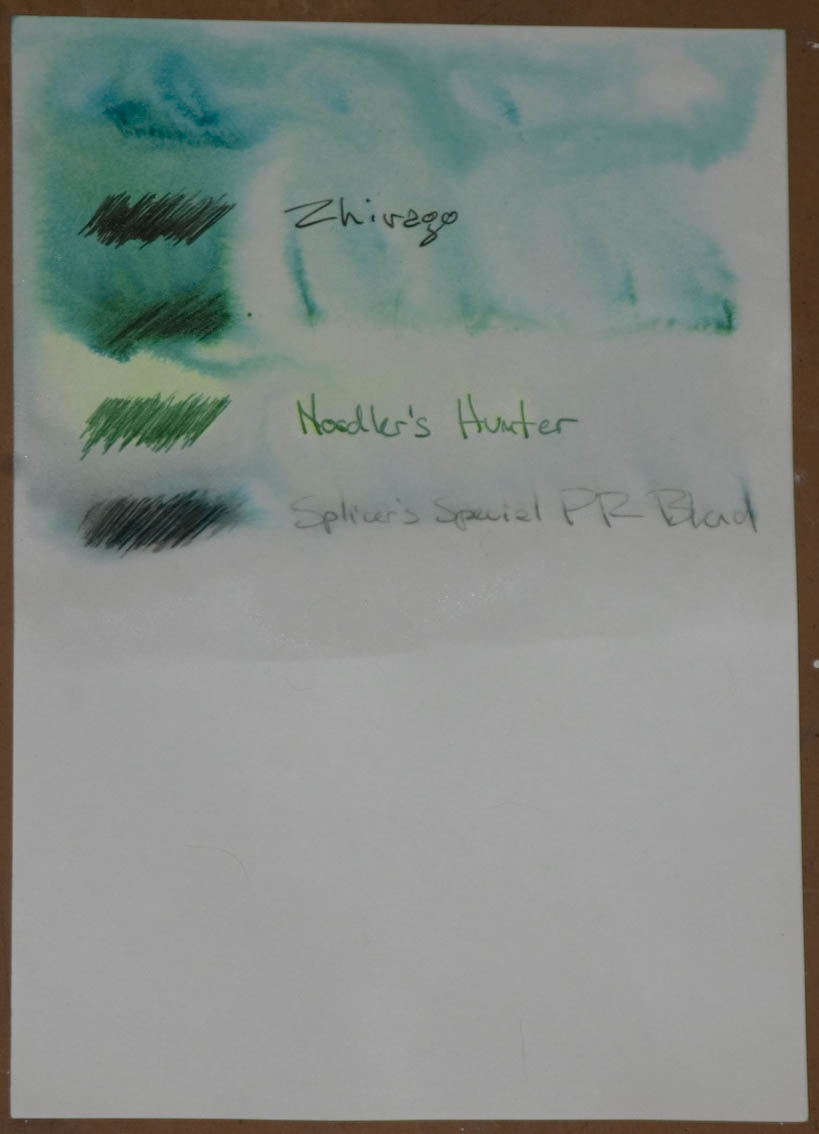
You can see from the photo (sorry, the scanner is in the studio and I only wanted to make one trip in the rain) that there is very little left after the initial dunk. The inks had all been dry for hours before I soaked the sheet and the ink on two of the samples is gone beyond all recognition.
.After five minutes in the boiling water, there is no longer any evidence that Sherwood or Waterman Green was ever on the sheet. Noodler’s Hunter remains true as though nothing had happened to it.
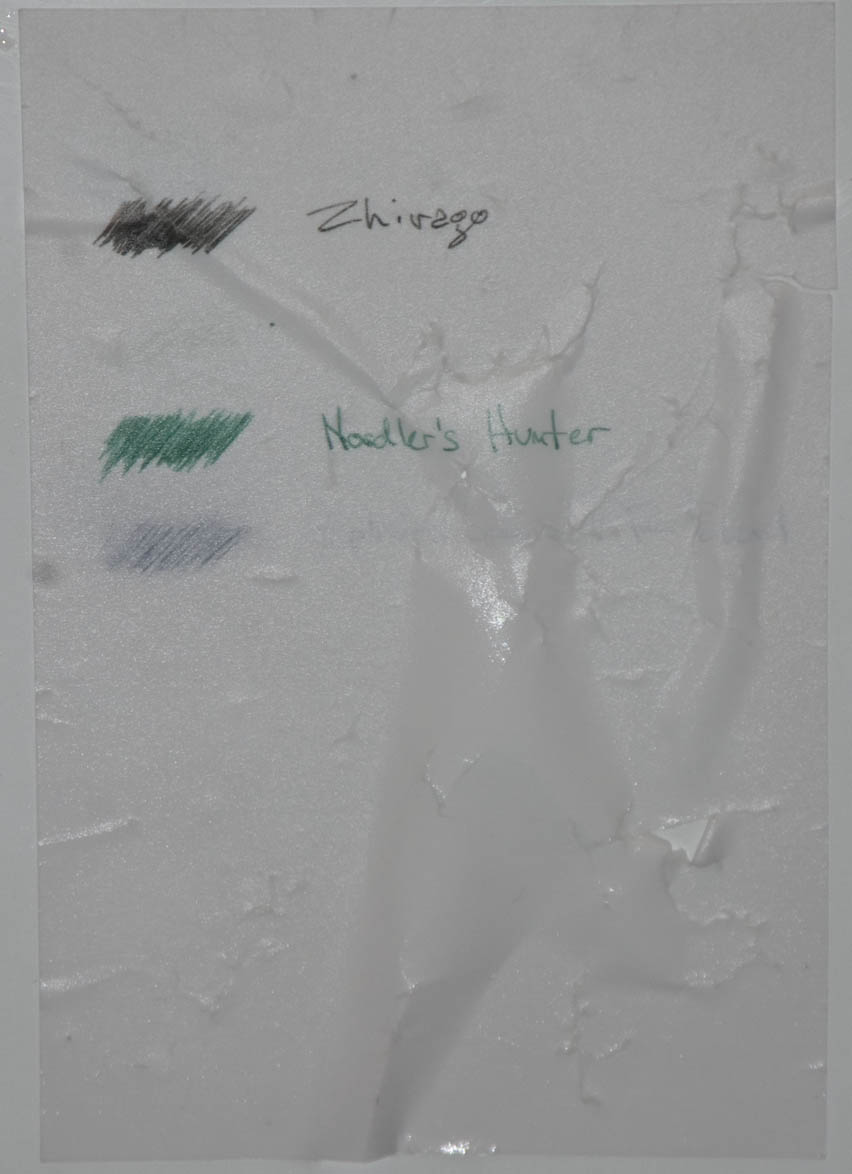
Two of the results are slightly surprising. The Zhivago sample is clear and legible, but no longer has any color to it. It’s as though they took their impervious black and mixed it with some green pigment and called it «nearly» because the green pigment would wash away even if the black would remain. Perhaps that’s exactly what they were thinking, I don’t know.
The second surprise is that, though badly faded, the Private Reserve mixture does remain visible, if only barely. My guess there is that the black ink is more resistant to water than either the green or the grey. The amount of black in this mix is very slight, so even if it were quite colorfast there wouldn’t be much to see.
Noodler’s does have some well-known drawbacks. Most of the Noodler’s inks have strong odors that, while noticable with the ink bottle open are usually not problematic while writing. Noodler’s inks (and the two featured here are no exception) tend to exhibit «nib creep» where the combination of capillary action and surface tension draw the ink to the top of the nib. This is harmless, but not ideal when you have a lovely nib to show off.
Though I probably will abandon Zhivago in favor of PR Sherwood (or the greyer blend) for most writing, this experiment has convinced me to sign my checks only with Noodler’s. Probably will be the black. Or the brown. I like Noodler’s Walnut quite a bit, and it is another «near-bulletproof» ink.
However, brown inks are a subject for another day.
green ink
I love green inks and have found to my pleasure that there is no perfect ‘green’. The collection now numbers 34 different bottles.
Each day brings its own excitement and colour requirements.
My quest has been to find my idea of British Racing Green. That wonderful colour that Stirling Moss had in the 1960’s.…. in my dreams.
Ascaris
Greenis PR blend
I realize this is considerably after the fact, but, would you happen to remember the proportions of your PR blend? Can you tell me anything about the ink’s writing qualities?
thanks
t