Red Ring Cycle
 In 1998 I purchased a fine point Rotring 700. This was my first foray into what some would call the realm of fine pens, although Rotring has tended to make pens that are more practical than the ones that usually get categorized that way. Until then I had used the Parker Vector, which generally gets classified as a «student» pen, and I was ready to see what spending a bit more would get me.
In part I wanted to test a point: that there is a law of diminishing returns when increasing spending for pens. As with many things, it is true but not quite so simple. There are fountain pens with extraordinary price tags that do not write any better than a fifteen dollar student pen like the Vector, and middle-range pens that give more expensive pens a run for their money. There are truly excellent pens that command a high price tag, but even then it takes someone with a bit of experience and who knows what characteristics they really like in a pen in order to appreciate what those prices will buy. Nevertheless, it’s generally true that small increments in the quality of the writing experience come from large increments in price. A $120 pen will have noticeably better materials and workmanship than a $20 pen, but think about that for a moment. The difference is only «noticeable», not «stunning» or «astounding». A $350 pen will be generally indistinguishable from a $120 pen in most people’s estimation. And the difference in quality, materials, and design between a $350 pen and a $1000 pen is truly subtle.
There’s a secondary rule in place that causes divergence in the price/quality curve. This is the marketing rule that often perception drives demand more than quality. Because of this, with many products it is true that the quality of a product will actually decrease with increased price. Example: you can pay $60 for a pair of sunglasses designed to withstand high-velocity impacts like rocks kicked up by motorcycles or even bullets. In the $500 range, you mostly have fashion items that provide about as much protection as lenses made from cellophane. Similarly, you can spend several hundreds, even thousands of dollars on a Montblanc with great brand recognition and prestige value — walk into a law firm with a Montblanc sticking out of your pocket and be prepared to command great respect — but with quality of materials and design comparable to a $120 Parker or Waterman.
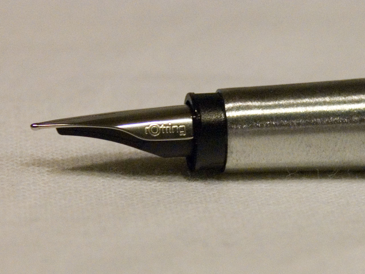
The result of my search for the sweet spot of price versus quality in a fountain pen was the Rotring 700. Rotrings generally have smooth, stiff nibs which make them both loved and hated by fountain pen users. The Rotrings are almost all steel nib pens rather than some variety of gold, which loses them points in may collector’s books. Yet the 700 has one of the smoothest steel nibs ever made, so who needs gold?
I tried both the 700 and Rotring 600 at the counter when I bought the 700, and was not impressed with the 600, whereas I fell in love with the 700. Rotring was subsequently acquired by the Sanford Corporation, who trimmed Rotring’s product line, keeping the 600 and eliminating the 700. Over the years I’ve heard countless raves of the 600 but always looked down my nose at them a bit. Sure, the 600 is a good pen, but I had the superior and substantially less-common 700.
My 700 traveled many thousands of miles with me, and never gave me trouble even when I exposed it to the duststorms on the playa at Burning Man. Sadly, the clip got bent and the 700 suffered enough abuse to take on some dings as well as some other cosmetic damage. It was when the cap stopped posting properly that I decided to retire the pen. A fountain pen with a loose cap is not something anyone wants in their pocket.
There began my search for a replacement. As I’d never seen a 700 other than the one I had, and repeated searches on eBay and Google yielded nothing, I resigned myself to seeking out other Rotrings. I had in mind as a possibility that I could transplant the nib of my 700 onto another pen body, but at the very least I would give the 600 line another try.
In the past several months I’ve purchased several Rotrings. My search took on some urgency when I learned that Rotring fountain pens will no longer be distributed in the United States. My search then was for stores that still had «new old stock» Rotring pens, online retailers in other countries (my thanks again to cultpens.com in the UK), begging friends and associates in Germany to look for me, and of course eBay.
My first try was the Rotring Initial, mentioned here earlier so I won’t go into too much detail. It’s recommended to anyone that likes a smooth pen with consistent line, but it does not have the razor-sharp lines of many other Rotrings. The Initial is a solid-feeling pen, which lends itself very nicely to writing, but is just a little heavy for drawing.
 The Rotring 600 really is a nice pen, but it deserves its own post which I’ll leave for another day. Instead, I intend to focus here on two interesting curiosities: the Rotring Rive and Rotring New Orleans.
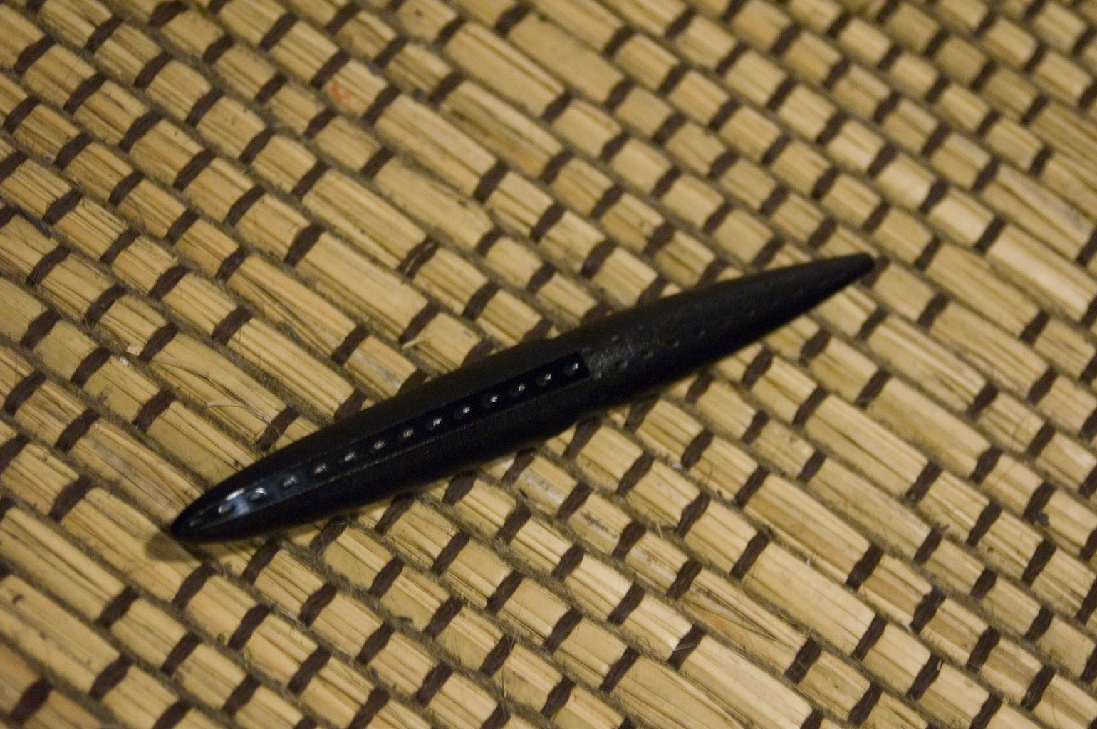
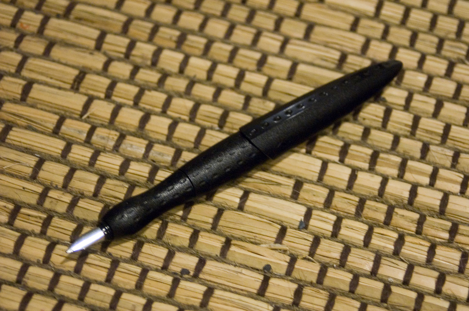
The Rive is an ergonomically designed pen, but made so inexpensively that it feels like a novelty. At sixteen grams, it doesn’t feel like a Rotring at all, and I have to wonder whether this is the result of creative experimentation or dumb directions by the overlords at Sanford/Newell/Rubbermaid. In fact, now that I think of it, Newell could have some strong incentive to force its subsidiaries to use more plastic and less metal. But I digress.
 When capped, the Rive looks as though it were a prop from a bad science fiction movie, like some sort of alien seedpod. The entirety of the barrel is covered in dimples at regular intervals that must be there to promote grippiness, except that they don’t do so very effectively. Removing the cap reveals a contoured section designed to mimic the curves of one’s thumb and forefingers, which seems nice, but being made of the same hard plastic as the rest of the pen’s body ends up not being very comfortable at all. A soft-rubber grip in this shape might be more comfortable, but I found the shape itself to be too limiting. When holding a pen my thumb and forefinger usually are not directly opposite one another. With the Rive, they must be, which results in come uncomfortable curling of my forefinger.
Despite its shortcomings, the Rive does have a few niceties. I found it to be quite clever how the section screws into the barrel with a positive click to ensure you that you’re done twisting and to prevent it from accidentally unscrewing itself. It’s a thoughtful feature that makes the use of the pen simpler, especially for someone new to fountain pens.
The nib is surprisingly smooth, although it may have to do with the «fine» point being closer to a medium. It appears to lay down a line broader than the New Orleans’ medium point, in fact.
It’s an interesting experiment and not without merit, but the execution of the Rotring Rive leaves quite a bit to be desired, even from a student-grade pen. Instead of innovative and clever, it comes across as tacky and cheap. Certainly not attributes I thought I would ever ascribe to a Rotring pen. In the end, I’m not sure that I dare call it a Rotring. It is the only Rotring pen of any variety that I’ve ever seen that did not have Rotring’s trademark red circle somewhere on the pen.
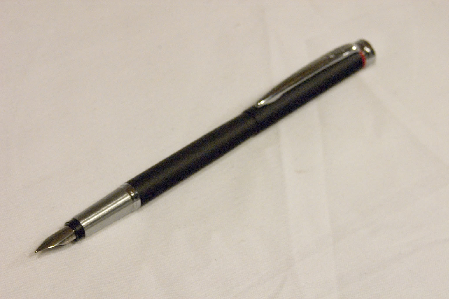
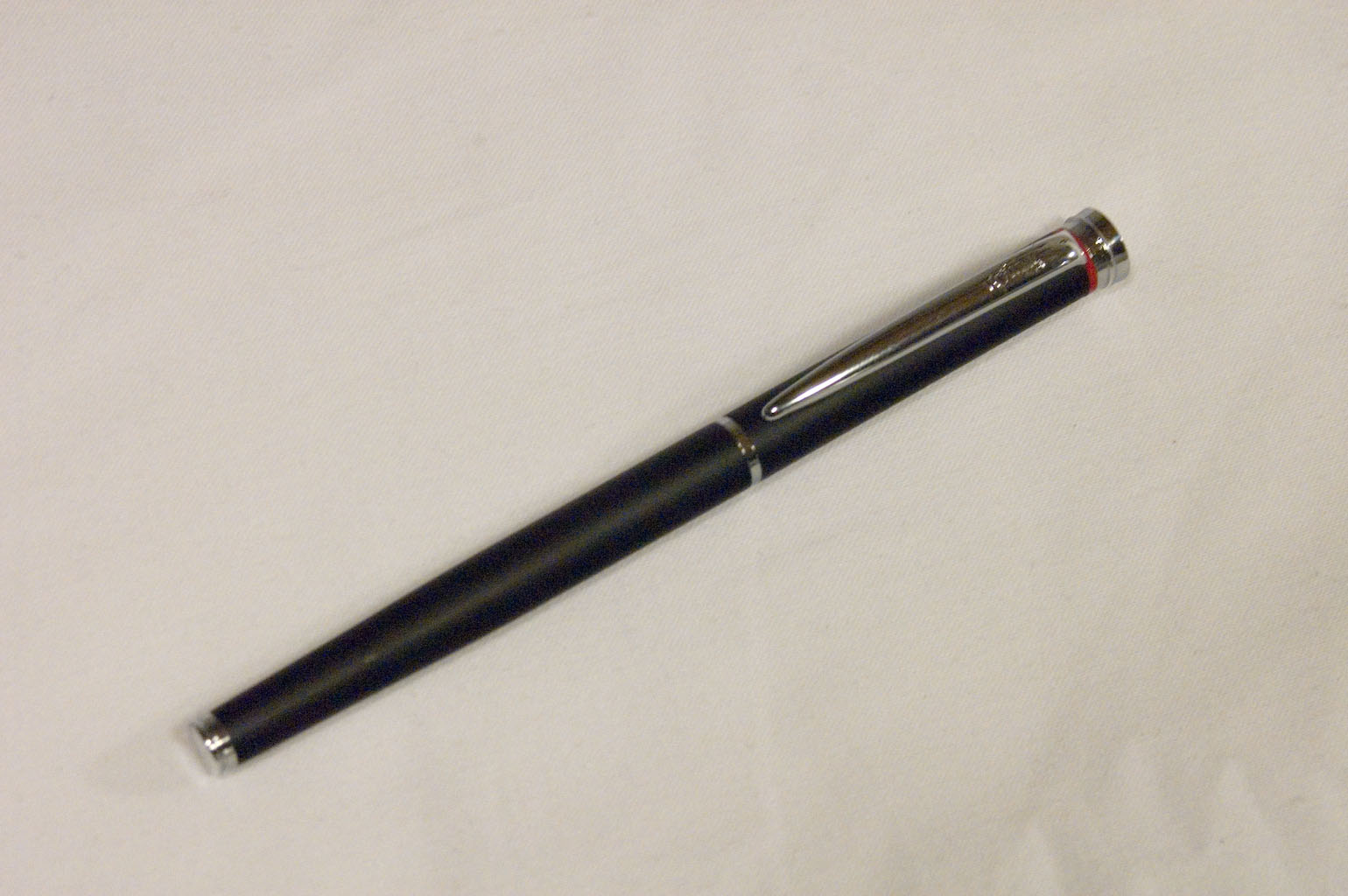 The New Orleans, however, generally lives up to my expectations of a Rotring. It is of similar size and shape to the 700, and only two grams lighter. The cap posts and fits with a positive click — perhaps too positive, as it takes a bit of force to snap on — and stays securely. In truth, there’s something about it I can’t put my finger on that feels like a student-grade pen rather than a precision writing instrument like the 700 or the 600. However, as I said I can’t quite see why it feels that way.
While the 700 is well-balanced enough to be used with or without the cap posted, the New Orleans has a lot of its weight in the cap. Though the New Orleans weighs in with cap at 26 grams to the 700’s 28, the New Orleans cap by itself is fourteen of those versus the 700’s cap which is eleven grams. That leaves the uncapped pens at thirteen and seventeen grams respectively. (Please forgive rounding errors here. I know that fourteen plus thirteen is twenty-seven, not twenty-six. My scale does not measure increments smaller than one gram. The numbers here reflect the results of weighing each component rather than simply subtracting the cap weight from the total weight. The numbers were triple-checked and the scale calibrated in between.)
Between the New Orleans’ relatively short length uncapped and the lighter uncapped weight, it really wants to be used with the cap posted. I generally prefer writing with the cap posted, but I am bothered when a pen seems incomplete without the cap on the end. I know that many prefer to write without posting the cap and I consider it to be a virtue if a pen is as pleasing with or without the cap.
 Nevertheless, this is a solid-feeling pen, if a bit light, and someone with smaller hands might prefer the New Orleans even without posting the cap.
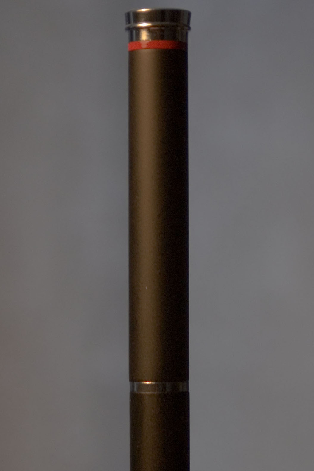
The design of the New Orleans is visually captivating. There is a subtle taper to the barrel and the cap, leaving the top of the cap slightly thicker than the end of the pen. Then there are two elements which reinforce this subtle variation. First, the end of the barrel has a chromed ridge, which functions as the snap which holds the cap when posted. This ridge is smaller in diameter than the barrel itself, adding to the visual effect of the overall taper. The top of the cap similarly has a decorative headpiece wider than the rest of the cap, looking much like the echinus and abacus of the capital of a Doric or Toscan column.
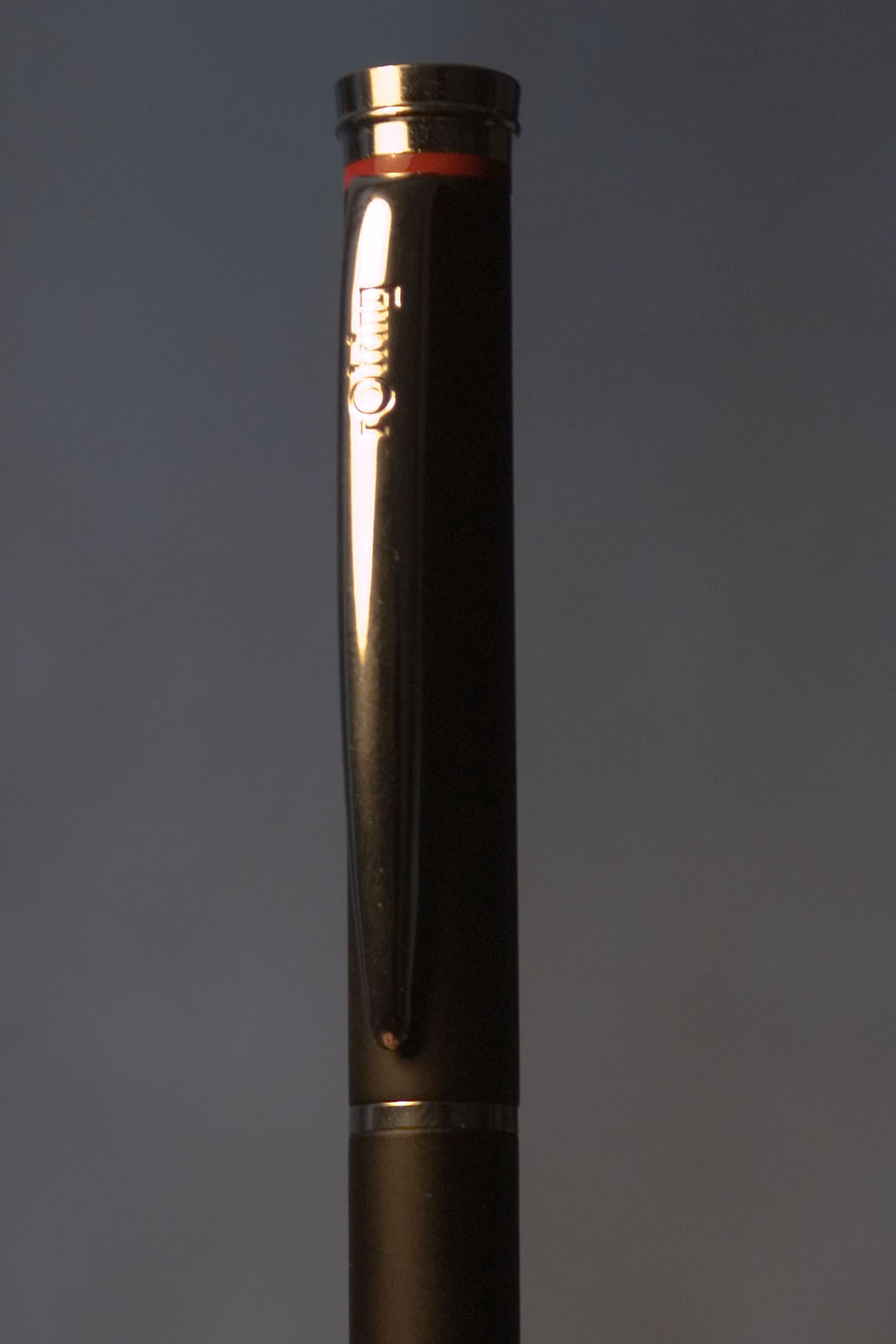 This classic shape plays against the clean, modern lines and the matte black finish (as well as Rotring’s red ring) to create an intriguing stylistic tension. The old and the new influences harmonize in an unsettling way, like the striking of a minor chord. The clip is rounded and tapered, making it looks something like a spider’s fang. These elements add up to a quietly dramatic presentation that might be at home in one of Anne Rice’s vampire novels. The name New Orleans therefore seems particularly fitting.
While more weight in the pen and less in the cap would suit me better, the arrangement does permit the option of writing with a featherweight or moderate-weight pen. One would think then that the pen with cap posted would be extraordinarily cap-heavy, but the effect is not as pronounced as expected.
The nib is exactly what should be expected from Rotring: a smooth, stiff point. As some have said, it’s a nail tipped with glass. Anyone expecting a pen with flex should avoid Rotrings generally, and this is not an exception. Be warned though, that while stiff, the Rotrings, especially the writers like the New Orleans, are not totally devoid of personality. The points of Rotrings are known not just for their clean, consistent lines, but as well for pleasing if sometimes surprising variations that show up in flourishes.
One final reservation about the New Orleans. Its matte black finish looks to be quite susceptible to being marked. Just a few weeks of use has already begun to leave a shinier ring around the barrel where the cap posts. This underlines my hesitation to suggest it for those that prefer a moderate-weight pen. For someone who likes a small, lightweight pen and who does not post their caps it will make a very pleasing writer.
After years of searching, I did finally find not one, but two Rotring 700s made available on eBay. Both are new old stock EFs, still with their stickers showing a price of DM 120,-. Although I still have not removed the stickers, I did successfully transplant the fine nib from my old 700 to the body of one of these EFs. It’s writing like a champ. If the soul of a pen lies in the nib, then this is new life for the Rotring 700 so dear to me, simply with a new tube and furniture. Having this new lease on life and knowing now how difficult it was to find, I think the 700 will deserve better protection than I gave it before.
Rotring 700: 28 grams
Rotring Initial: 47 grams
Rotring Rive: 16 grams
Rotring New Orleans: 26 grams