
Red Ring Cycle Part II or 600 Bottles of Ink on the Wall
The Rotring 600 is Rotring’s most popular and well-known fountain pen, with the possible exception of their inexpensive ArtPen line. When people think of Rotring pens, they almost invariably think of either rapidographs or the 600.
There were a couple of 600s in the pen case the day I bought my 700 back in the late nineties. I tried them out and didn’t care for them as much as the 700. Of course, I’m glad that I bought the 700 then, as they subsequently became difficult to find, and the 600 model has always been plentiful. When I recently decided to revisit the 600 line, it was no trouble getting my hands on them, I even found an old-style 600 as «new old stock», an unused pen that had waited on a shelf in the shop for several years. But I’m getting ahead of myself.
The 600 has a characteristic hexagonal shape to it. It was designed not to roll when placed on an inclined table like a drafting board. Now, it will slide down a table with not very much tilt (15° from horizontal) to it, but it’s true that it will not roll.
The Rotring 600 is an engineer’s pen. It wasn’t that long ago that engineering and architecture students bought up the stock of 600s from any shop that carried them near their campuses. It is modern, stark, has clean, utilitarian lines, and heavy. The Rotring 600 is clearly not your grandmother’s fountain pen.
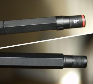 When Rotring began making the 600, its ends had diamond-grid knurling at the first half-inch or so, and the cap sported a window that could be rotated to reveal the indicator of the size of the nib. After the first few years, Rotring switched to a simpler model with smooth ends, and no such turret. The pen’s cap is shorter on the newer style 600s, but uncapped the pens are the same length. Since the cylindrical end of the barrel is shorter on the newer model, the cap rides a bit higher when posted, making the newer model almost 2mm longer with the cap posted, despite being roughly 3mm shorter when capped.
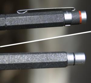 In the last years of production of the 600, it was rebranded as the Rotring Newton. Many newer-style 600s were sold as Newtons, but the real change happened a couple of years ago when Rotring completely redesigned the Newton. Despite the rebadging of the 600 prior to the redesign of the line, I still refer to any of the two older styles as a 600, and refer only to the completely redesigned models as Newtons. If anyone from Rotring’s marketing department wants to take it up with me, I’ll be glad to take the call.
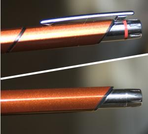 The new Newton retains the hexagonal shape, but the corners have been rounded, making the design less severe. The clip and cylindrical ends are now chromed and polished, whereas previously these parts were either black or a matte silver. But the greatest change to the character of the Newton comes from the diagonal lines. All of the transitions of the pen — barrel-end cylinder to barrel, barrel to cap, cap-end cylinder to cap — are cut on a 45° angle diagonally, making the bottom facet of the pen shorter than the top. There is only one way to cap the pen, and that is with the clip oriented over the top of the nib.
 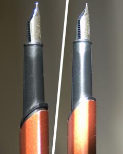 This is a mildly interesting exercise in design until one considers unscrewing the section from the barrel. With the connecting surfaces at a 45° angle to the axis of the pen, there is no way that the section could be unscrewed from the barrel, as with most other pens.
Rotring, apparently wishing to impress with their engineering prowess, designed the section and the barrel with recessed threads, the barrel’s threads on a rotating sleeve connected to the barrel-end cylinder. In order to fill the Newton or replace a cartridge, one twists the end cylinder, which gently pushes the nib and section up and out of the barrel. Rather than screwing the section into the barrel, the barrel screws itself onto the section, from the inside.
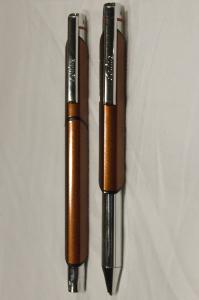 It’s a clever gimmick, but I wonder whether it serves a practical purpose or if Rotring was indulging in a bit of showing off. The design is much more complex and therefore is likely to be more prone to failure. Perhaps quality materials offset this potential, but psychologically the damage is done. I keep my Newton, along with matching mechanical pencil, in a protective leather pouch. My older 600s appear simple and indestructible and therefore sometimes find themselves in a pocket as I head out the door. The Newton may be as durable as its predecessors, but it doesn’t feel that way. It feels solid, but not the way the 600s do.
New or old, the pens of the 600/Newton series are consistent, precise, and smooth writers. These are not pens that will give you expressive lines from the flex of the nib, as there is very little flex in their nibs. They lay down a clean line and rarely have ink flow problems.
Many people dislike a nib this stiff. As much as I appreciate flexier nibs, I use both flexible and inflexible pens. When I want a lot of variance to my lines I’ll reach for some other pen. But for an unwavering line of even weight, it’s hard to beat a Rotring. And for all the years that I avoided 600s in favor of my 700, well, the 700 is still the better writer in my opinion, but the 700 permits a little bit of personality in the line. This is desirable in writing and even sketching, but when I have a variety of pens at my disposal, the 600 is the one I’d use in place of a rapidograph. I admit I did myself a disservice not to have gotten a 600 earlier. My original 700, were it a 600, would have weathered the abuse better over the years. I’d recommend an original or second-generation 600 to anyone looking for a traveling pen, even under harsh conditions. Take it to Antarctica if you like, just make sure that you load it up with Noodler’s Polar black or blue so the ink won’t freeze. For those who absolutely must have a gold nibbed pen, Rotring made a few 18K-nibbed 600s that appear on eBay from time to time.
The 600 series pens are built like tanks. They are heavy and tough. It’s a common joke that these pens could be used as weapons. These are brass-barreled pens and as such carry a bit of weight. Even the Newton loses only about five grams in the switch to aluminum construction. This is sure to make those of us who like heavy pens happy, but will rule out the rest. If you don’t like a heavy pen, this is not borderline heavy, so stay away.
As might be expected from heavy pens targeted at engineers, everything about the 600s snap into place precisely. Capping, uncapping, and posting a 600 may require a bit more force than you’re used to, but then it comes off cleanly with a snapping sound. There’s never any doubt that the cap is snugly in place. Though the Newton does click when capping and uncapping, it is essentially a slip-on cap and lacks the solid feel of the earlier models. The earlier style 600 also has a slip-on cap, but feels much more secure. The second-generation model of 600 incorporates a pair spring-loaded studs or bearings on the section to mechanically secure the cap into place. This addition to the design secures the second-generation 600 in my mind as the pinnacle of the line. While it’s natural to idolize the original (and yes, the original style tends to be more highly sought after by pen collectors and knowledgeable users) the only real feature that went by the wayside with the second generation is the movable nib-size indicator on the cap. The knurled ends don’t seem to serve any purpose aside from attracting collectors. The other stylistic refinements are minor, but the spring-loaded locking of the cap ensures that the cap will remain secure much longer into the life of the pen. This is a feature I’ve seen only on a few high-end Waterman pens and makes the second-generation 600 more desirable than the original.
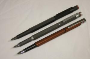
The original and second-generation 600s were available in three colors: black, silver, and a finely-speckled dark grey they called «lava». The lava finish has a bit of texture to it and adds to the attraction. In black and silver the 600s are good-looking pens if you like stark, function-driven, modern design. If you don’t you might find all the 600s to be hideous. Still, though perhaps harsh-looking, the pens are not garish at all and will not offend. A 600 will be as appropriate in the boardroom as it is in the workshop.
The Newton was made available in black and in silver, but along with the angled redesign Rotring replaced the lava option with a handsome metallic brown they call copper. Though the finish is finely speckled like its predecessor in lava, the similarity stops at the appearance. The barrel of the copper Newton is as smooth as the black or silver varieties, no substitute for the superfine-grit feel of the lava 600.
In many ways the Newton is a step down from the 600, but as the successor to the 600 it is not unworthy. It carries forward the 600’s tradition of being a smooth and reliable writer and while it puts down a clean, consistent line it does have just a hint of responsiveness not found in the 600s. Perhaps it’s best to think of the Newton as a companion to the 600 rather than a replacement for it. It is no replacement for the 600, but on its own merits it is a great pen. If you’re going to pick just one of the three however, I say leave the mystique of the original and its knurled ends at the door and find yourself a second-generation 600.
Rotring 600 (old style): 43 grams
Rotring 600 (newer style): 42 grams
Rotring Newton: 38 grams
about the 600 series
Great description about the Rotring 600 series.I like the rotirng 600 & 700 series since I got my first 700 fountain pen and ballpoint pen almost 20 years ago!
Thanks for your nice report!
Rotring 600
I used to work in Graphic Design in the days before i.t. and the conversion to computers, and have used all of the popular technical drawing pens, both by hand and in compasses.
One day, a Rotring rep came around and gave us all a free gift (to induce more sales) of their ArtPen. This aroused my interest in some of their other products, so of course the Rep’s free gift was doing its work on me as planned.
I bought myself a 600 (old style) set which included a fountain pen, a rollerball pen, (same shape as the fountain pen) and two smaller pens of the same design as each other, which turned out to be a ball point pen and a mechanical pencil. All were Matt Black, very smart and a little heavy. The cost of this lot was for the time, quite expensive, but it was quality over quantity.
20 or more years on all of the pens have had much use. I aquired a couple more of the 600 pens over time, this time choosing the Matt Silver option as I noticed that the black paint wears off at all of the edges and points of contact. This in itself is quite attractive and shows the careworn patina of much loved pens. So for a change I bought a silver fountain pen and a silver ball point, again both having had lots of use.
With all that wear and tear (though they are very robust) both fountain pens are now currently out of commission because of broken nibs. I found that I had to clean the ink transporter and nibs quite often and had to remove them from the pen body and soak them in a solution. You could do this operation because that’s exactly how you change over the nibs when you order a new size, I had a Medium and a fine.
However, over time the black plastic ink transporter that holds the nib in place have become brittle and have now both broken, also the nibs have too been damaged and are not usable. My problem has been in replacing these items as Rotring have been of no help in this matter. I am aware that they have changed thier model range and the parts that I need seem impossible to source, especially here in the UK it seems?
I have visited art shops that supply new Rotring products but found that whenever I ask about the stuff I need , I get a look from the assistants like I’ve just asked them to get me something from biblical times? I’ve found a few Rotrings on places like Ebay, but they are for whole pens and are asking a premium price for them, but I don’t need a whole pen that costs three times what I paid for the pens I already have. So, if anyone could give me a clue then I would be once again, a happy person!