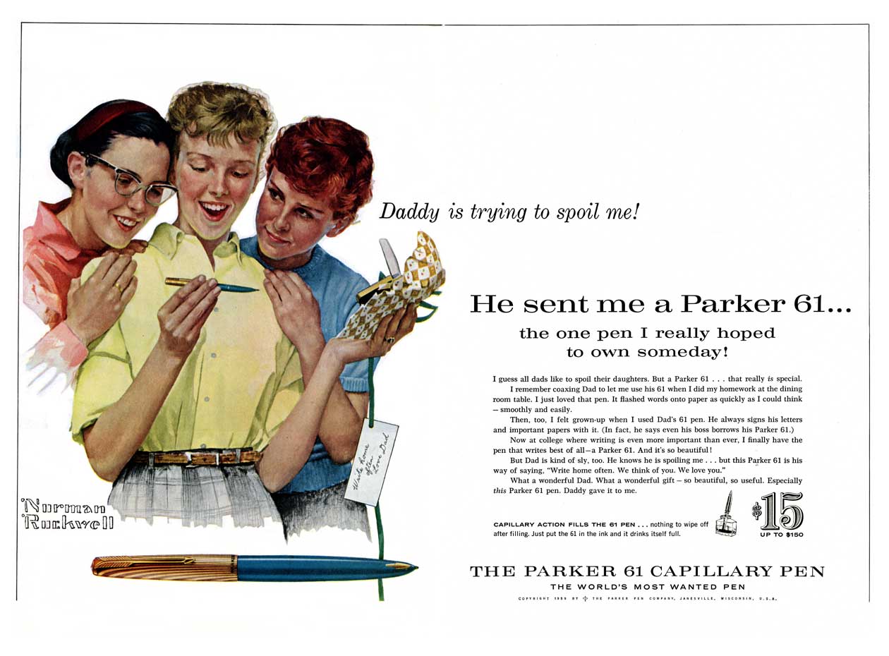
1959 Rockwell Illustration for Parker 61
I came across a very small reproduction of this advertisement while reading David and Mark Shepherd’s Parker ‘51’. Although the Parker 61 fountain pen is mentioned only briefly in their book about the iconic ‘51’, the use of Norman Rockwell illustrations in Parker’s advertisements was too important to ignore even if they were for the «wrong» pen. The 61 is one of my favorite pens, and I daresay I like mine better than my ‘51’. With a little searching, I found a copy of the Saturday Evening Post from October 1959.
I’m really enjoying all the advertisements in the Post. Advertising in the late fifties was so clever! I suppose there’s a downside to that, as the advertisements don’t disappear into our consciousness the same way that modern ads do. There’s always a sense of the advertiser’s voice and the agenda is never hidden. The cleverness comes in how we’re manipulated to buy the products that are advertised, not so much in disguising the fact that we’re manipulated. It’s easy to see why Showtime’s Mad Men is doing so well.
There’s so much going on in this ad in particular. A lot of these factors enter into modern advertisement as well, but I think that the extra time it takes to illustrate an advertisment allows for greater nuance than we normally see. Every aspect of Rockwell’s painting is targeted directly at the consumer.
First, look at the symmetry of the color blocking. The girl with blue-black hair is opposite the redhead, and wearing a red blouse while the redhead wears blue. Our blonde’s blouse is yellow, keeping all the attention right on her while our eye orbits her going back and forth from red to blue and back.
Our girl is pretty and wholesome-looking, just how every dad sees his daughters, right? It’s so easy to imagine being proud of that little girl, off to college and away from home for the first time. But there’s more to it than that. See her friends? Her friends are pretty, too, but not as pretty as she is. She is popular, and at the upper echelons of her social clique. Her friends envy her, and not just because Daddy sent a nice pen.
Her raven-haired bespectacled friend is happy for her. Look at the joy and wonder on her face as she wishes that her Daddy would send her something that nice. It’s easy to imagine that this girl follows our blonde around trying to be as much like her as possible. «Our» daughter is looked up to and admired by her peers.
The redhead is a different story. Her smile is much less enthusiastic, and look where her eyes are pointed. She’s not looking at the blonde, nor even at the Parker 61. She’s looking over at the girl in the glasses. She’s not just jealous of the blonde, she’s trying to play it cool and not let on how much envy she has. Further, she’s a bit annoyed at how much attention her other friend is dishing out on the blonde. Not only is our girl admired, we see, but she is envied for her popularity.
Note also, that our blonde’s left hand ring finger has an engagement band. The redhead’s ring finger is bare, and I think that we can assume that the other girl is not engaged. «Guys don’t make passes at…» right? Something we know in the real world not to be true, but in the make-believe world of advertising I think it’s safe to assume that our black-haired friend will die and old maid despite having quite the pretty face.
Finally, read the ad copy and see what it says about dear old Dad. My favorite is how Dad’s boss sometimes borrows Dad’s Parker 61. Here the copywriters have snuck in some information about Dad’s social and professional status. Dad is the guy we all would like to think we are. He’s an everyday guy, a worker among workers, but he’s close enough to the top that he shares his pen with his boss. And of course Daddy is recognized by those around him as a man with extraordinary taste in pens. Otherwise, wouldn’t the boss have his own Parker 61?
Deconstructing the ad in such an analytical matter feels a little cynical. I hunted this ad down because I found it to be charming and sweet. The manipulative hooks of the advertising material make it more so to me, not less. By pointing out these things I’m trying to highlight the virtues of the ad, not any flaws. It’s well thought-out and clever with a depth that betrays the saccharine-glazed veneer. A very nice piece of Parker ephemera.
Awesome
Your blog has us laughing out loud. The ” red head” is my mother. Great!
Very Good Article!
Come accross your blog while Googling for this particular ad…
I was searching because I recently had the good fortune to find some original 1957 photos of Norman Rockwell actually painting the canvas… including the three young women and Rockwell posing them.
Thank you for the interesting and article.