
Looking Back: Who Did I Copy?
I’m listening to The Art & Story podcast, Episode 004 «The Big Style». Mark Rudolph and Jerzy Drozd are reaching back into their early comic influences. Comic artists are absolutely the first illustrators that inspired me to copy them and do what they do. It’s gotten me thinking about who my early influences were — and when I say «early» I mean certainly before art skool. I’m looking back roughly at ages twelve to seventeen. This is who I copied and who I wished I could be like.
John Byrne
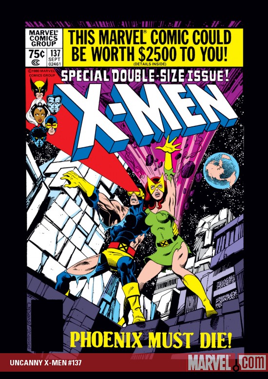
Yes, I have to confess I was a John Byrne fanboy. His work on X‑Men and Iron Fist just grabbed me and was responsible for my being drawn to comics in the first place. I’ll never forget finding all those early Byrne issues (without covers) in the basement. They were John Byrne Iron Fist and I think Carmine Infantino Ghost Rider. Byrne’s earlier work was filled with detail (at least compared to many of his contemporaries, and to his later work as well) and though he followed many comic-book conventions, the work wasn’t oversimplified the way I thought Ditko and Kirby’s work was.
In retrospect, I have to give Terry Austin some of the credit. No one ever inked Byrne’s pencils the way that Austin did. Austin’s linework is expert and it took a few years to begin to understand the relationship between an inker and a penciller. I’m listing him out of order of my awareness of his influence because his work was a huge part of what I copied.
Paul Smith
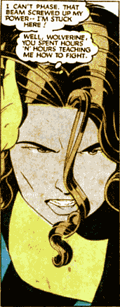
Paul Smith was my favorite illustrator for years. Going back and looking at his work I’m a little more critical of it than I was, but there’s still something about his work I find compelling. He used clean lines, good balance of shadow and light, and his style is uncluttered. Sometimes his figures are a little wooden and awkward; it might just be the lens of nostalgia, but even that seems to make the style more endearing. There’s a sort of dignity to the stiffness in his poses, and that might be the important part. Even when he oversimplified, Paul Smith’s work was always full of care and respect for his subjects. Even when reading a superhero comic book, a reader wants to feel the artist is invested in telling the story well. That Smith pulled this off is to his credit. (Note: I just can’t resist linking to the Sequential Tart writeup of X‑Men 168, the issue from which the panel here came. Marissa Sammy loves how Paul Smith drew Kitty Pryde, so I suspect she and I would get along.)
Neal Adams
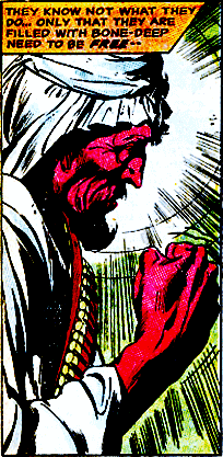
Neal Adams’ work appealed to me for much the same reason as Byrne’s, and this will foreshadow someone else on this list. Adams’ work looks like commercial illustration from the late fifties or early sixties. While Byrne’s work looks like comics, Adams’ work (more than a decade before Byrne got started) transcended comics. His work was of a calibre not previously seen in a medium that takes it’s name from stencil drawings on the sides of cartons. I don’t want to trample the work of many of the greats whose work I’ve since come to appreciate, but with only a few exceptions before the late sixties artists with traditional illustration skills weren’t represented in comics. Not only did Adams’ work have a life and fluidity to it, he also has a terrific grasp of perspective and foreshortening. Looking at those original X‑Men it’s hard not to feel that the pages are really coming alive.
Dave Sim and Gerhard
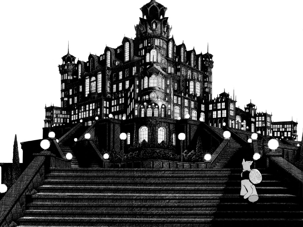
My love for obsessively crosshatched pen and ink work came directly from Dave Sim or, more accurately Gerhard who did all of the backgrounds for Cerebus starting with issue #66. Prior to this, I thought of black and white artwork as being artwork which hadn’t yet been colored, or which was not to be colored because color printing was too expensive. Gerhard built lush textures with one tool almost exclusively: lines. Lots of lines. When you can create not just tones but surface qualities using only combinations of pure black and pure white, there’s some kind of magic happening.
Vaughn and Mark Bodé
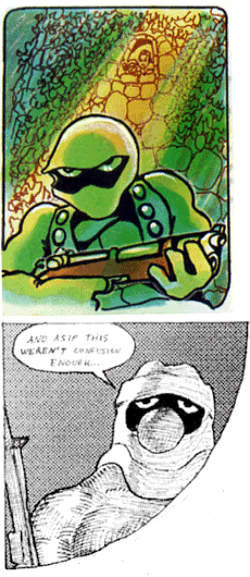
For a short while, I tried to copy Vaughn Bodé and his son Mark. My character Killer Nougie from the comics I put together in high school is a shameless rip-off of Cobalt 60. The difference? Killer Nougie had a big nose. And wore a double-breasted trenchcoat. Stylistically the influence didn’t stick much, probably because the sort of loose cartoon work both Bodés did required a lot more skill than I had. Okay, a lot more skill than I have.
Bill Sienkiewicz
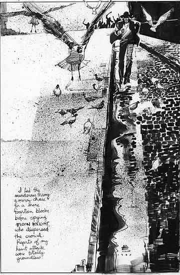
Then Bill Sienkiewicz took everything good about Neal Adams and turned it on its head. Sienkiewicz’s work was the first illustration that didn’t just tempt me to copy, but to deconstruct and to stop taking myself so damn literally. His work introduced me to the concept of derendering, something I’ve almost completely forgotten about. Looking at Bill Sienkiewicz’s work at the end of the Moon Knight run was really where I started to understand that anything was possible. Then he kept pushing farther with his work on New Mutants and went on to fully-painted work in the Elektra: Assassin series and Stray Toasters. Some thought he went off the deep end, but it was because he was swimming in the ocean.
Steve Bissette and John Totleben
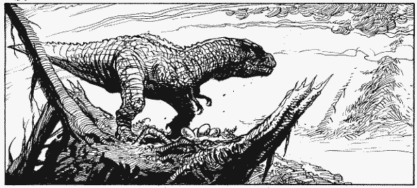
Steve Bissette and John Totleben were doing something like what Sienkiewicz did, except coming from the Joe Kubert camp rather than the Neal Adams camp. These two opened my eyes to possibilities of page and frame layout that broke all the rules and still worked. The lines these two made were incredibly expressive and illustrative at the same time. A few pen strokes and brush strokes and it’s all over. It’s the kind of work that is loose and gestural and spot-on exact at the same time. I still joke that some day I’ll grow up and become Stephen Bissette.
Michael Cherkas
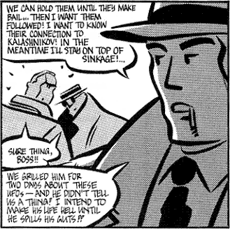
Michael Cherkas’s The Silent Invasion opened my eyes to the value of brush work. I tried doing a whole story only in brush (Rick Trigger: The Cop With His Mouth Full published in the back of The Saga of Elf Face. If you don’t already know, don’t ask. Really.) and discovered how difficult it is. I still have nowhere near the facility with a brush that I should have, but I owe whatever chops I have to attempting to copy Cherkas’s style from Silent Invasion.
I still surprise myself by how much I like Cherkas’s artwork. It’s not my normal fine-line figurative realist fare. But the appeal of Silent Invasion is much more than just the intriguing plot. The fluid geometry of Cherkas’s figures is engaging and delightful. His style is consistent and unique while most artists lose their style when they improve their consistency. Cherkas’s brushwork creates a voice than enriches and informs the plot of Silent Invasion as much as than the story informs the artwork.
Matt Howarth
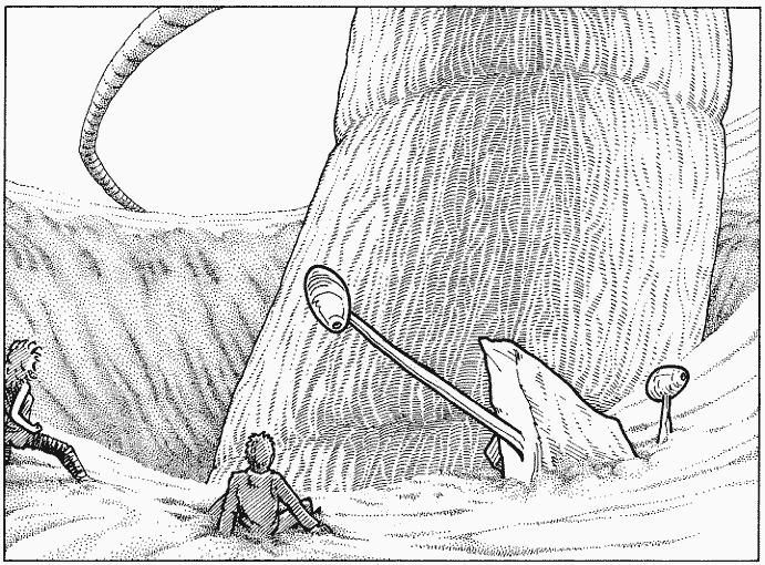
How can I possibly say enough good things about Matt Howarth? I can’t. He proved that painstakingly beautiful textural pen and ink rendering and a simplified, cartoony style can live together on the same page and the same drawing without losing coherence. This is a guy who can really cartoon and render. If Stephen Bissette is who I want to be when I grow up, Matt Howarth is who I want to be after I achieve enlightenment, take the Bodhisattva vow, and return to Samsara until all beings can be enlightened. Or after I get shifted to Bugtown. If those aren’t the same thing.
Deal Whitley
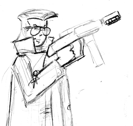
It seems almost unfair to list him here because he was a mentor to me and so his influence was direct, but a list of my early influences would not be complete without mentioning Deal Whitley. Deal helped put it all together for me in ways none of the above could have. Deal showed me not just what other people were doing right or wrong, but what I was doing that was right or wrong. He was always generous with his time and his advice and he helped expand my illustration and storytelling vocabularies.
This could not possibly be a complete list, and of course I’ve acquired inspiration from many others since the period of time I’m describing. There are greats I’ve tried to learn from but didn’t imitate as directly, like Will Eisner, Frank Miller, Matt Wagner, Jaime Hernandez, Walt Simonson, and many others. The fourteen artists listed above, though, represent a fairly complete line-up of the different directions I’ve been pulled in as an artist, and not just as a comic artist or as an illustrator. It’s an exercise that shows me more about my history than anything else, and writing about each of these artists — even briefly as I have — shows how far I have yet to come.