Two companies that get design: iPhone versus Palm Prē
A few months ago Monochromatic Outlook compared the iPhone with the Nokia E75, evaluating the device with all the features a user could ask for against the device with a focus on user experience. It was evident that Nokia’s approach of cramming technology together into one package left something to be desired without attention to the user interface.
Now for a quite different challenge: a comparison of the iPhone with another device designed with the user in mind. Palm’s WebOS may not have the market share enjoyed by Apple, but it was crafted with a similar eye to making the experience of using it smooth, straightforward, and even enjoyable.
Form factor
 Before talking about the operating system and software design, a comparison of hardware is in order. The iPhone is typical of modern smartphones; a slate, mostly touchscreen. There are no moving parts save the volume controls and home button. Most Android devices have taken this form a step further, employing ever-larger screens for movies, games and Web browsing. For a handheld computer, this is a great trend. For a phone, larger may not necessarily be better.
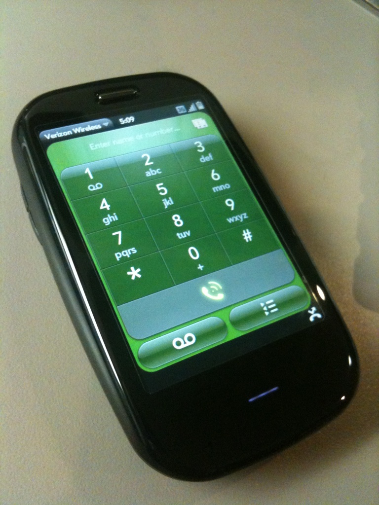
The Prē’s 3.1″ screen is substantially smaller than the iPhone’s 3.5″ screen. Four tenths of an inch may not sound like much, but put the devices next to one another and the difference is clear. I have to imagine that compared to the new Droid X’s 4.3″ screen that either of these devices looks like a younger sibling.
The Prē eschews some of the simplicity of the iPhone. The slider design and hardware keyboard make the Prē physically more complex, at least at first consideration. In hand, however, it is surprisingly simple. When closed, the device feels solid and uncluttered. Because of the curved track of the slider, even when the device is opened to reveal the keyboard, the lines of the phone still make a consistent flow. It lends the Prē the appearance of being a phone rather than some kind of PDA.
Not that there’s anything wrong with PDAs, but since the convergence of phones and PDAs the trend has been to make phones more like handheld computers. I applaud part of that trend, but I want a phone to be easy to hold and simple to use. Complexity, power and large screens can get in the way of a phone’s ability to be a phone.
This trend toward larger phones is likely to continue. Brighthand reports that the next version of the iPhone will be a larger model, with a 3.7″ touchscreen. It’s been a while since I read any rumors that Apple might produce a smaller device, no matter how much I think it would be an improvement. The push has been on for some time to make thinner and thinner devices to make them more pocketable, but after a certain thresholds devices get so large that they won’t fit comfortably in any pockets no matter how thin the device is. If you want something that is comfortable to hold, thicker in depth and narrower in width is the way to go.
Software design
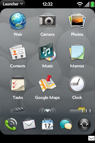
 Palm took the principles behind a multitouch touchscreen interface a step farther than Apple did with the iPhone. iOS’s touchscreen vocabulary is pretty much limited to tap, tap-hold, drag, and occasionally swipe. For essential functions (for example, exiting a program) you still have to use a hardware button on the front. Instead of using a hardware button, Palm extends the touch-sensitive area below the screen for gestures. You bring up the Launcher, go «back» a level (in a browser but also in other applications) and switch between applications all using gestures in this area below the screen, which Palm calls the «gesture area». The name seems a bit misleading to me since the entire screen is used for gestures, but Palm didn’t consult me prior to naming it.
As a result, going back to the iPhone and its hardware home button seems crude and awkward. It’s a small touch and shouldn’t be a deal-breaker for anyone, but I have to credit Palm with creating a system that immerses the user more deeply in the language of gestures.
The Prē was designed for multitasking, whereas on the iPhone having multiple apps open is a recent afterthought. A flick of the finger displays «cards» of each running app which can be scrolled through and closed with another flick. It’s simple, visual, and easy to understand. On the iPhone, it’s not immediately clear which apps are left. To see the open apps, one double-presses the hardware button, and icons representing the open apps appear at the bottom of the screen. If the home screen wasn’t dimmed, there would be no way to know we weren’t looking at the dock icons. These icons can be scrolled through and selected. It’s an adequate system, but app-switching seems like a hidden feature that was never meant to be used.
Palm missed an opportunity by not including an on-screen keyboard in WebOS. Both WebOS devices, the Prē and the Pixi, have hardware keyboards and I’m sure that Palm’s designers considered a software keyboard superfluous. That’s arguably true on the Pixi, but on the Prē the keyboard is hidden until the user pulls it out from behind the touchscreen. An onscreen keyboard would make it possible to use the Prē without ever sliding the device open. I understand that some people aren’t comfortable with an on-screen keyboard, but there are good reasons to prefer one: onscreen keyboards can be used more quickly and with less effort than an array of tiny push-buttons, and the act of sliding the keyboard out is slightly awkward. The sense of using a leftover technology felt when pushing Apple’s home button is felt more intensely every time the Prē must be physically opened and mechanical buttons pushed in order to type.
There is a virtual keyboard available to be installed, but it is little more than proof of concept. It requires the user to install a «homebrew» patch to the operating system and takes three full seconds to start. When the keyboard does appear, Palm’s inferior type-correcting algorithms become more obvious than when using the hardware keyboard, perhaps because it’s easier to miss a key when typing on a smooth screen.
The availability of «homebrew» apps is a nice benefit to using a WebOS device. In contrast with Apple’s dictatorial control over what apps are available and Google’s laissez-faire approach (which has given rise to rampant malware) Palm has provided a central software store for approved apps but doesn’t make it difficult for more adventurous users to install beta versions or home-made software, or even patches to the operating system itself. Sure, jailbreaking an iPhone isn’t that hard either, but it has only recently been made clear that jailbreaking your iPhone is legal and Apple still uses scare tactics to keep people away from the option.
Visual design
 Both companies have made visually stunning devices. Palm commissioned David Berlow of Font Bureau to design a font just for WebOS devices. It’s called Prelude and it’s a clean geometric sans-serif font. Prelude is a handsome face, but its geometric lines are a bit impersonal and mechanical for a device that is otherwise smooth and rounded. Palm should nevertheless be credited both for commissioning a custom typeface and for trusting Berlow with the task. My criticism here is that Berlow’s affection for geometric sans-serif faces distracts from Palm’s overall vision for WebOS.
The Palm Prē’s and (with the exception of the iPhone4) iPhone’s screens have the same pixel resolution, but the Prē’s screen, as noted earlier, is significantly smaller. The Prē’s icons, though they appear larger in screenshots, are approximately the same actual size as the iPhone’s. Where the iPhone’s home screen looks crowded and almost cluttered by comparison, the Prē has breathing room between its Launcher icons. While that means that there are fewer icons visible, it also makes for a more relaxed environment in which to interact with the device. On average, Apple (as well as the third-party developers of iPhone apps) has better-looking icons, but the environment carries unpleasant visual tension except on the iPad where the larger screen affords Apple the option to leave space between the icons.
This trend sometimes seems to go too far with the Prē, however. Some of the screens feel overly sparse. The menus and networking status pop-ups, for example, take up more room than they should.
Satellite computer versus cloud device
Palm’s WebOS is so named because of the «Synergy» features which take data sources from around the Web. One’s local contact database is automatically kept in sync with one’s Gmail, Facebook, Yahoo and other address books. Calendaring is handled the same way. WebOS is designed never to sync with a desktop computer but instead to get all your personal information out of the Cloud.
Apple has their own MobileMe cloud service with which the iPhone will sync, but for the most part, the iPhone doesn’t rely on the cloud. It expects users to sync with their desktop address book, desktop calendar and so on.
Those of us who don’t want our personal contact and calendar information out in the cloud will prefer the iPhone for this reason. Third-party software (Mark/Space’s The Missing Sync) enables the Prē or Pixi to sync directly with a desktop computer, but that adds $40 to the total cost of ownership unless you want to keep your address book and personal information on Google’s servers.
Camera
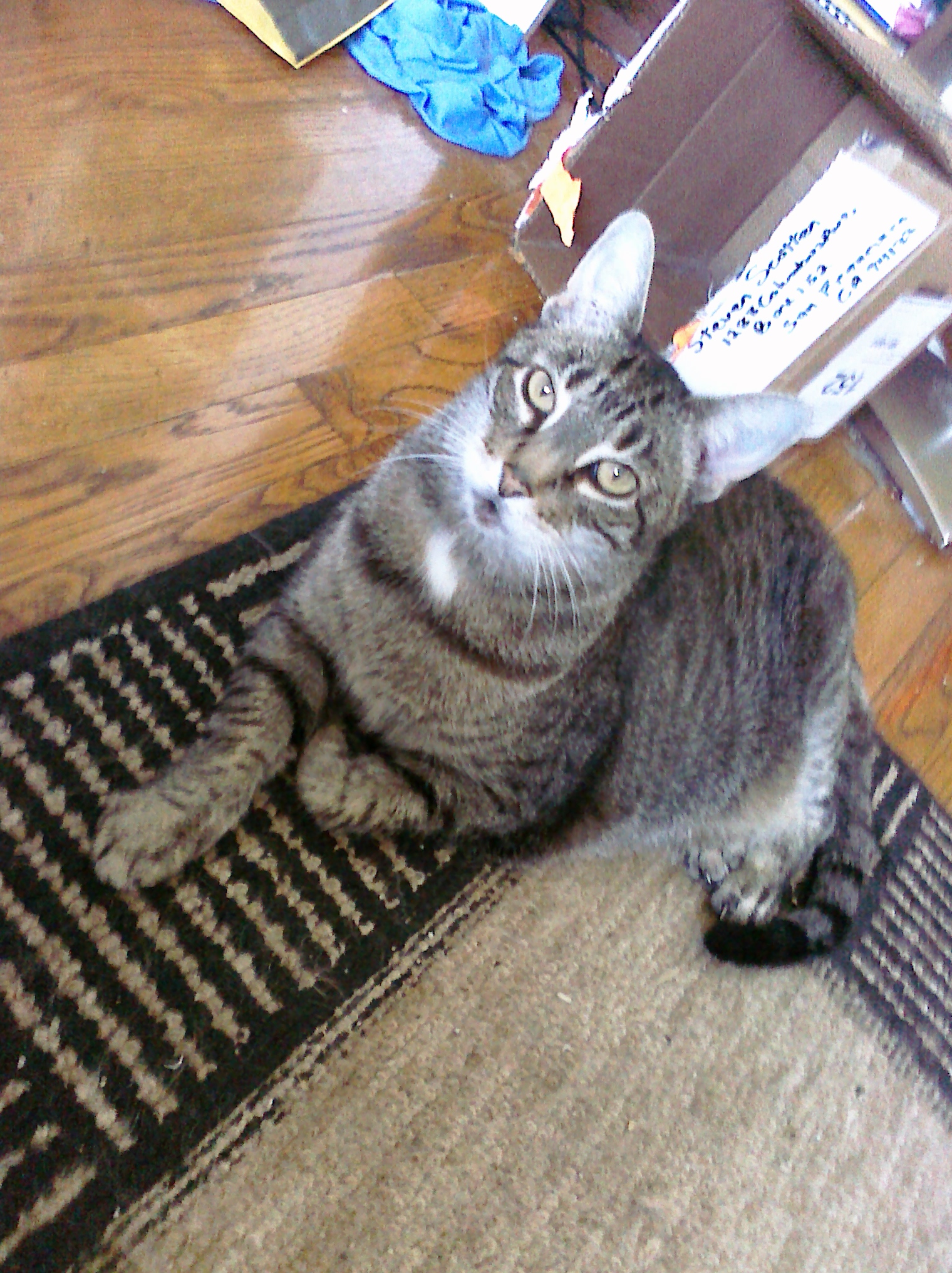
 The quality of a camera is probably the least important feature on a phone, but always having a camera to take snapshots with is very handy. I often photograph receipts so that I don’t have to carry them around with me. It seems worthwhile to make a cursory comparison between the cameras on these devices. There are many models of iPhone and two models of Palm Prē, but I’m comparing the Prē Plus with the iPhone 3GS. Both devices have nearly the same resolution (1520 x 2032 for the Pr? Plus and 1536 x 2048 for the iPhone 3GS) so it seems like a fair fight.
The Prē’s camera has an LED flash (a feature found on the iPhone4 but not the 3GS) but that is the only win the Prē has with the camera. Its fixed-focus lens is a wider angle than the iPhone’s, which tends to make for more dramatic images, but it also means you have to get closer to your subjects. The iPhone’s software has a zoom feature, but the image quality is degraded if you zoom in very much.

 The Prē’s camera will not zoom, but it’s just as well. The image quality of the Prē is about that of the iPhone when the iPhone is zoomed in all the way. It’s adequate, but the iPhone clearly has the superior sensor. In these two photos, it’s easy to see that the Prē’s image has a real problem with artifacting.
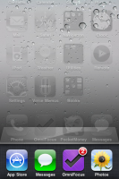
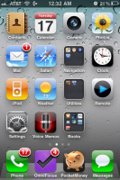
The Prē also has a fixed-focus lens, which means it cannot adjust to subjects that are nearer or farther. An image taken closer than a couple feet away will therefore come out blurry and out of focus. See the images of the two devices at the top of this article; the Prē’s picture was taken with the iPhone and the iPhone’s picture was taken by the Prē. Note how much sharper the image taken by the iPhone is.
Conclusion
If you want a handheld computer, the iPhone with its immense collection of apps and well-designed user interface is the better choice. While Apple has taken great pains to distance themselves from the Newton, they seem to be going in that direction more and more. Despite the superior multitasking capabilities of WebOS, the scales tip in favor of the iPhone because of the iPhone’s predictive and autocorrecting text entry and because there’s a much wider array of applications for the iPhone despite Apple’s stranglehold on the iPhone app market.
The Prē on the other hand, makes a better phone and communication device. Though it loses points for the keyboard, the software design makes communication tasks (telephone calls, text messaging, instant messaging and email) simple and convenient. The Prē can’t compete with Apple on robust, mature applications, but there are a few good ones out there. Palm’s focus when making this phone was, oddly enough, that it work as a phone. There’s no doubt it is a smartphone, but it is a phone first and foremost.
The Prē is getting a little long in the tooth. While it performs acceptably, it is not as snappy as it should be. Palm underclocked a 600mHz processor to 500mHz in the Prē. There are lots of people out there overclocking their Prēs for this reason. A couple years ago 500mHz may have seemed adequate, but the goal is to have the device disappear so that the user doesn’t have to think about it. Having to wait through transitions or for data to load means not just thinking about what’s happening, but being painfully aware of the process.
The latest speculation from Brighthand suggest that HP and Palm may have a new device available shortly. That’s good news for WebOS users not only because it would provide an upgrade path with presumably faster hardware but also because any chance of WebOS gaining decent market share hinges on capturing the minds of smartphone buyers with new models. Palm needs to relaunch the brand in people’s minds once again, and the only way that will happen is when new devices hit the market.
If this speculation is correct, I’m hoping that they release their device in the next couple of weeks. That’s how much time I have to return my Prē to Verizon. I’d hate for a fantastic new device like that to come out while I’m waiting out a two-year contract on the older model.
Shouldn’t you be comparing the Pre to the iPhone 4?
Shouldn’t ya’ll be comparing the Pre to Apple’s latest iPhone? It’s got a killer display and badass camera(s).
Have you tried Spaz for WebOS yet? Interested to here how it works with StatusNet. http://getspaz.com/#submenu-mobile
If I were making a purely
If I were making a purely head-to-head comparison between devices, I should compare the Prē Plus with the iPhone4, yes. But I don’t have an iPhone4 and I’m more interested in the differences in the operating systems. I know I compared the camera on a head-to-head basis but there I think that comparing to the 3GS was more useful because the resolutions are similar. The quality of the Prē’s camera came up short even though the resolutions of the cameras are almost the same.
On the form factor front, the iPhone4 is even more like a brick than the 3GS (Apple really crapped the bed with the iPhone4’s hardware design) so comparing to the 3GS was the more charitable choice.
That display is killer and I hope that it starts a trend of higher-resolution devices. The human eye shouldn’t be able to pick out jaggies on a display and you can on almost every device on the market.
I have indeed tried Spaz for WebOS. It works with identi.ca but not with standalone StatusNet installs like status.smscotten.com. It’s supposed to but there is a known bug. The next version is promised to fix that bug but all that’s known about the next version’s schedule is the word «soon».
http://help.getspaz.com/discussions/mobile-problems/46-statusnet-setup