A couple of pens from my sketchbook
This is how I got started with the series of pen and ink drawings of pens and ink bottles. I’m not even sure what it was at first that intrigued me, but it’s not that difficult to figure out. I love my pens and these were good exercises in texture and reflection with a variety of surfaces. There were challenges with these drawings, but they are sketchbook pieces, so I didn’t want to take them too seriously.
My sketchbook is not just a place for me to experiment, it is also a place where I apply a lot of critical judgment. I can see my mistakes and my tendency toward certain kinds of mistakes very clearly in sketchbook work, whereas when I’m building an image as part of a series, I’ll do everything I can to hide my mistakes. The problems I see in my «finished» work tend to be individual problems rather than problems that are part of any recurring pattern.
Then, too, is the question of how successfully I blind myself to my own artistic shortcomings. I’m sure that there are troubles in my more polished pieces that are apparent to others but which I have no awareness of. There’s a lot less ego tied up in sketchbook pieces, and so it is easier for me to have perspective about the strengths, failures, and other qualities of such drawings.
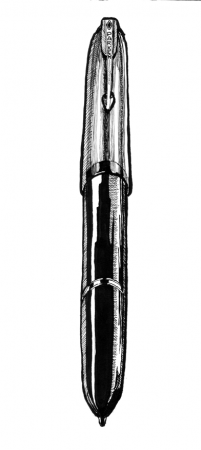
The pen above and to the right is my 1945 Parker ‘51’ that I wrote about in the post Meet The Parkers, Part ‘51’. I still write with the ‘51’ quite regularly, though perhaps not so much since I got my Parker 61, which I shall have to write about someday soon. The 61 is the pen I had been looking for when I was offered the ‘51’ and its style is a bit newer. The 61’s design is from more than a decade before I was born, so it might be fair to call either «classic».
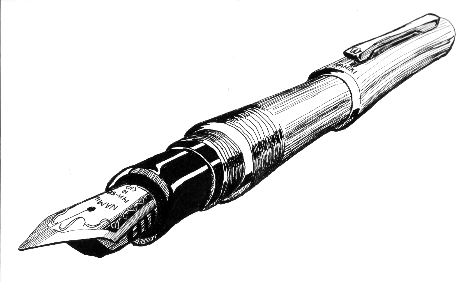
The pen below is my Namiki Bamboo in the rhodium finish. I have one in black as well now, and they’re both terrific writers. You can read more about it in my post Pilots Great and Small. There are photographs there so you can see for yourself whether I did any justice to the rhodium finish. This one would have benefitted from a somewhat less hasty approach; though I very much like the loose curves of the threads and the barrel right above the threads and the overall value of the finish feels right, the texture of the finish does not. The lines are too shaky and to look smooth and they don’t even look casually put down. The perspective is a bit awkward as well, as the pen seems to be going in three different directions.
These of course are all things I can correct when I do it the next time. I don’t know whether either the ‘51’ or the Bamboo will find its way into the current Pens and Inks series, but I encounter some of the very same challenges when I work on those. The more ink goes down in my sketchbook, the better the quality of the lines I make at the drawing table.