
More Sketchbook Pens: Four Edsons
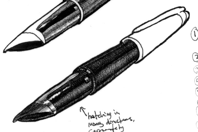 These are now pasted into my sketchbook, but are not actually sketchbook work, but drafts. I’ve mentioned this before, but often what I do when I’m not certain how to proceed with a drawing is to place vellum over the pencil drawing and take different approaches at rendering the section in ink. Sometimes these come out as almost fully-realized drawings and other times I’ll work only on one the area of the drawing. Sometimes I’ll rough out some ideas crudely and other times I’ll spend hours trying an approach complicated enough that I’d rather do it twice and like it than once and realize I don’t. And as you can see, sometimes I take notes along the way to remind me what to do the next time.
It’s not uncommon for me to like some of my drafts more than the final drawing, or at least to like some aspect of a draft more than I liked that aspect of the final. The barrel of the Edson to the upper right has a nice luminous aspect to it that the final piece also has, but not with quite the depth that the draft did. The spring-loaded cam on the section also looks nicer to my eye than the final. Of course, the draft has a number of aspects that make it not a candidate for prime time: the wavering of the outlines and the inconsistent blackish tone of the nib’s reflection, these come from the carelessness that it a result of my focus on other aspects. So sometimes I get some part more right in a draft. It’s an aspect of working that I have to accept as long as the final piece works.
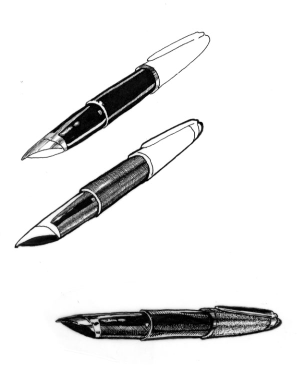
The following drafts are all a little cruder, but it’s not hard to see what I was trying with each. The last one at the bottom is the one that sold me on the decision to use stippling for the satin platinum finish of the Edson’s cap.
 Generally I use stippling very sparingly. It feels a bit like cheating because it’s relatively easy to make smooth tones without ever moving a pen across the paper. The required eye-hand coordination is less than with hatching or outline drawings and stippling is much more forgiving of mistakes. Consequently, when I see pen illustrations that use a lot of stippling, I feel a little cheated. There are some technically excellent drawings out there that look nearly photographic because they were created entirely in stippling. It takes skill, but something in me revolts at seeing that kind of work. It feels as though the artist played it safe. Even when representing mundane objects, art should never be safe.
I suppose a similar criticism could be leveled at me because I make so many drafts, but in the end I have one sheet of paper. I may get a few practice runs, but it comes out on that sheet of paper the way I did it the one time I knew I wasn’t working on a draft. It’s also possible to do very interesting things with stippling, so I don’t wish to write it off entirely. Sometimes, as here on the cap of the Edson, stippling is a good tool to bring out a particular kind of light and texture. You will certainly see me use it, but usually I try other methods first and stipple only when I’m convinced it’s the best approach.
So I’ll close here by paraphrasing one of the world’s best-selling greeting cards:
Boy: «Do you like stippling?»
<
p style=“padding-left: 30px;”>Girl: «I don’t know, you naughty boy! I’ve never stippled…”