Two approaches to design: iPhone versus Nokia
Well, this one’s gonna be a grudgematch, isn’t it? Apple and Nokia both make smartphones, and there the similarities end. Nokia and Apple fans flood the Internet with debate, each thinking the other has missed something critical. The conflict goes deep, rooted in the philosophies of the respective companies and how they try to meet demand for products.
Apple has been criticized by its detractors for making substandard but pretty products. They cite a lack of features or a lack of access to features in Apple products and dismiss Apple as having nothing going for it but an ability to advertise and market their products in a way that creates an irrational, hypnotic response. They say that Apple users are dupes who are fooled by the hype. Look at the feature list of the iPhone, especially in its first incarnation, and it’s easy to see that point of view. The feature set of Nokia’s lowest-end phone puts the original iPhone to shame if you are counting each feature as a line item.
Apple fans make excuses for Apple products by throwing around big terms like «user experience» and «human interface». And there is some truth behind those terms. Apple puts a lot of effort into guiding the user through the experience of using their products. If an Apple product does what you want it to, generally it won’t be that hard to figure out, and it will be accessible fairly quickly. There are some hidden features that a smaller set of users want, and often a set of features where you just can’t get there from here.
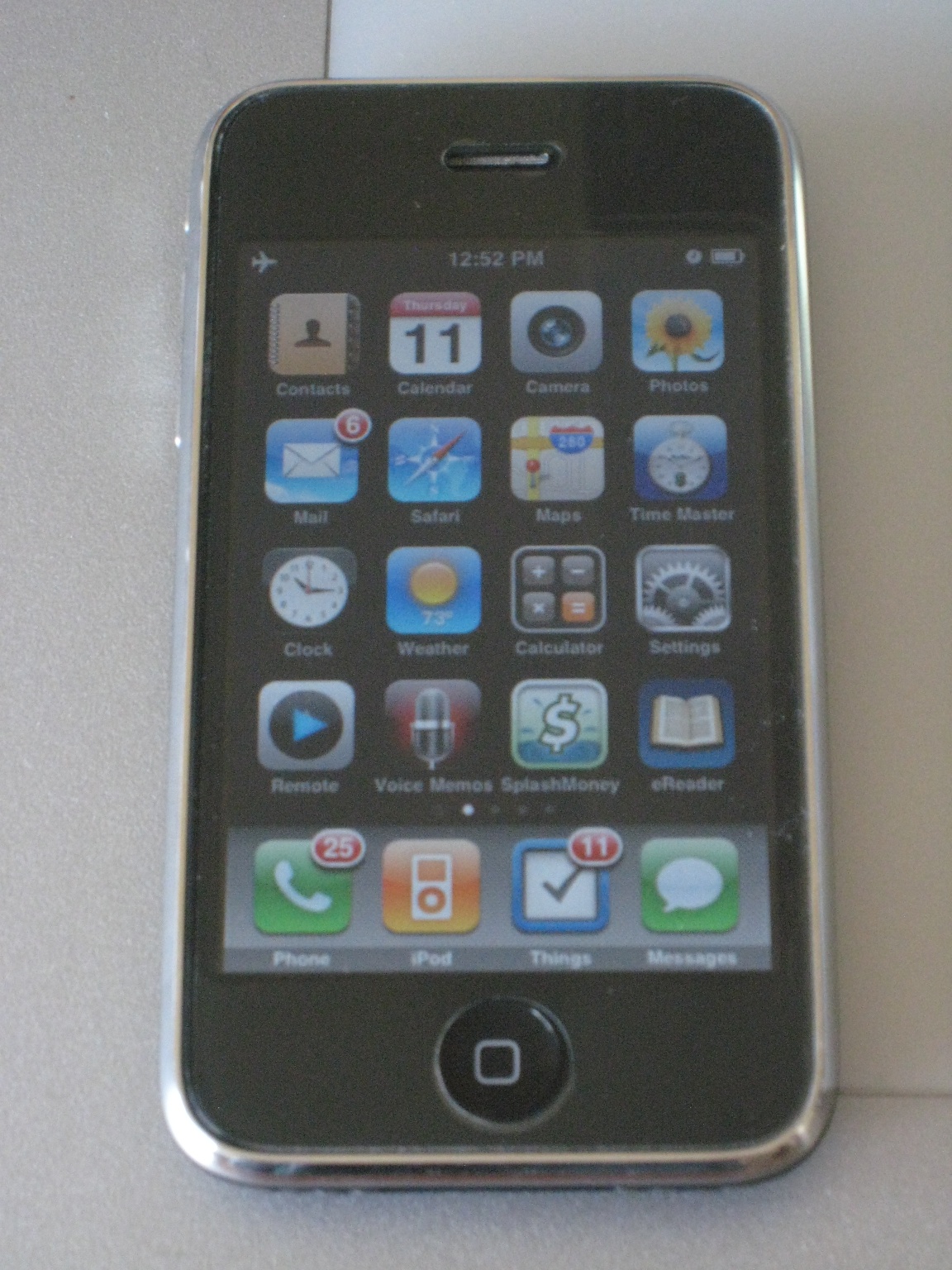
For example: if you want to view the raw source of an email on the iPhone, you’re out of luck. If you want to add CC or BCC headers, you have to change a default in your Mail settings in the iPhone Settings so that the To and CC fields are shown. Then you can tap on it in your compose email screen. Someone who is sufficiently motivated to use this feature can find it, but most people won’t use it or need it so infrequently that it can be hidden by default. If you want to read an incoming email or write an outgoing email, the critical features of any email client, you are two taps away from either task from the iPhone’s home screen. Apple’s designers clearly made some considered choices about what to include and how to include it. From a quantitative point of view, iPhone mail is lacking in the «view raw text» feature and has hidden the CC/BCC feature away. From a qualitative point of view, iPhone mail makes it quick and easy to do what most people want it to do most often. Limiting the available feature set is part of a design philosophy that does not treat all features as equal.
The antithesis of Apple’s «limited feature set» approach can be found at Nokia. Nokia’s top-of the line smartphones have truly impressive feature lists. On these lists, in various configurations you’ll find hardware QWERTY keyboards, high-resolution cameras with flash, FM radios, infrared serial connections, memory expansion slots, included instant messaging apps, VOIP capability, multiple hardware buttons, included office suites, tethering (to use the phone as a modem for your laptop or other devices) and Flash support: all features missing on the iPhone out of the box, many of which are totally unavailable for the iPhone.
Over the years I’ve had several Nokia phones. My favorite of them all was the old 6310i with its 96×60 pixel screen with no shades of gray. In 2002 it had bluetooth tethering to connect other devices to it’s then-fast GPRS connection for Internet downloads as fast as 38.4kbps. It’s still the only cellphone I’ve ever had that was as good as a landline. Nothing since has come close.
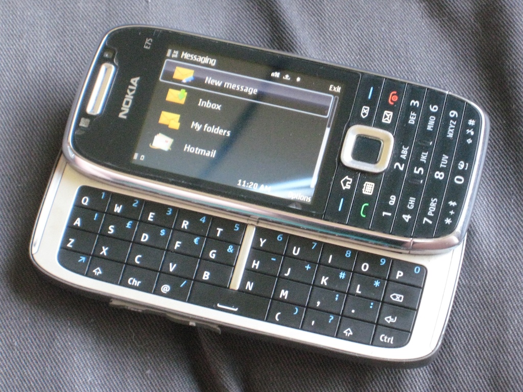
I tried out a top-of-the-line Nokia (the E75) last month. The E75 has Office software, WiFi, a camera with a flash, an FM radio, MP3 player, text messaging and email, a full QWERTY keyboard that slides out in landscape orientation. While there are higher-end Nokia phones in the multimedia and subnotebook categories, the E75 is pretty much the top of Nokia’s business-class offerings in America (many of Nokia’s best phones are not offered in the cellular frequencies used in North America). In comparison with the iPhone, it takes three keypresses to start to write an email, more if you want to read incoming mail.
An extra keypress might not seem like much, but it’s just the beginning. In order to specify a recipient from your own address book, you have to type several letters, then push a button to tell it to search, then select a name and an address. Compared to the iPhone, which starts guessing at the email address you wish to use for the mail’s recipient as soon as the first letter is typed, this is a long, cumbersome operation.
When I decided to try out the FM radio, it took me 30 minutes with the manual and Google’s help to figure out how to find the application. It took another 10 to figure out how to tune in to a radio station. Yes, it’s a feature that on paper Nokia can claim as a win over their competition, but I have to wonder if there is any point to including a feature like that other than to pad the feature list. As far as I’m concerned, adding this feature detracted from my experience of the phone. Can anyone fault me if I say that on the question of the FM radio the iPhone beats Nokia—even without an FM radio?

One would think that a phone with a built-in keyboard is just built for text messaging. Here too it seems that Nokia was focusing more on getting the features out the door than with actually creating something that would be useful to someone. Creating a text message has the same difficulties that creating an email would, and worse. The list of incoming text messages is purely sequential, with no threaded view and no way to search for messages from a particular recipient. You can laugh all you like at iPhone’s cartoon word-balloon display of text messages, but messages are seen there as a conversation, not like a pile of random post-it notes on your desk. It’s possible to look at the history of messages sent to and from your device.
Nokia’s text messaging screen looks almost as though it hasn’t been modified since the days of my 6310i. There’s blocky text full of redundant and mostly useless information. For any one of these messages if I want to see more than the first three characters, I have to select and open the message. Then to reply I can 1) push the OK button 2) push it again to confirm that I want to reply 3) select the option to reply by text message instead of replying by some other method.

To be fair, the Nokia here is providing more options. On the iPhone, there’s no direct way to send an email in reply to a text message; you essentially have to do it Apple’s way. But I’ve got to ask: how often will you ever reply to a text message with an email? I’m not saying it will never happen, but will it happen so often that I have to take extra steps with every message I reply to, choosing the method by which I will reply? Apple’s messaging app also doesn’t require me to confirm that I really want to compose a reply. If I start typing a message, it knows that I want to reply. In total, if I stay in the Messaging app on the E75 receiving a message and replying to it requires a half-dozen keypresses in addition to whatever it is I want to type.
As a side note, it is not entirely true that you have to do it Apple’s waythere are buttons at the top of the messaging «conversation» for calling or going to the contact information for the person the conversation is with. From the contact information it’s just one more tap to compose an email. It’s out of the way, but it is there. My point stands though: Apple put the infrequently used options out of the way and made the most used option the default.
I suppose it could be argued that hiding the FM radio away in the image gallery, as Nokia did, is the same thing. The FM radio is not as frequently used, so it can be stowed out of the way. But the FM radio is a standalone feature, not a lesser-used option of a feature. The fact that the location of the application that plays and tunes the radio isn’t even included in the user manual just makes it worse.
The actual experience of typing a message shows Nokia — once considered to be the king of user interface — to be even farther asleep at the switch. Both the iPhone and Nokia have predictive text options, and honestly, sometimes I find Apple’s predictive text to be annoying. If the word I’ve typed is one that Apple thinks should be a different word, I either have to notice and tap to override or end up with the wrong word. Most of the time, though, Apple’s predictive text gets it right.
Nokia’s predictive text is just frustrating. Here is a system that assumes that if you put a question mark at the end of a word, that you really must have meant to hit the apostrophe. Maybe it’s an easy mistake, as the apostrophe and the question mark are on the same key. You have to hit a modifier key in order to get a question mark. That just makes it all the more unforgivable. It’s not as though I might have meant to hit the key next to the one I did hit. The Nokia predictive text engine assumes that I hit the shift key by accident.
Nokia also makes it darn near impossible to get accented characters or special typographical characters in my messages. Apple made it pretty easy. Press the letter key that is most closely related to the character you want, and it presents you with choices. Press the C and hold it and you can choose from c, ç, ?, or ?. I still haven’t figured out how to make a cent symbol. Nevertheless, it’s easier to get at some of the accented characters on the iPhone keyboard than it is on my keyboard at home.
In the end, however, no amount of user interface magic can make up for a missing feature if that feature is one that you want. There are no software tweaks that will give your iPhone a flash for taking photos, and no fancy tricks for listening to your local radio stations unless they happen to offer live streams over the Web. Without jailbreaking your iPhone there is no way to use the 3G networking to turn your iPhone into a mobile hotspot (that was add on software on the Nokia, and it came in very handy when my cable went out early this month).
Personally, I don’t think the iPhone is really a very great phone. It’s a darn nice handheld device but the 3G networking interferes with voice calls. It also isn’t shaped like a phone. I’d much rather be holding the Nokia 6310i up to my ear — it felt like a phone and looked like a phone. The iPhone is too wide to cradle in my hand comfortably. It’s not bad that way, but not great. The E75 is better, but the sliding keyboard makes the whole thing sort of clumsy. I wish they’d bring back something the size and shape of the 6310i.
My point here is not that Apple rules and Nokia droolsin fact, I think on balance Nokia makes better phones than Apple. They offer a zillion different models with different featuresets and they make some of the best sounding phones out there. That is the point of having a phone, after all, right? So that you can hear other people? (The E75 by the way, is not the best example of this. It had acceptable call quality, but it wasn’t what I expect from Nokia.)
My point here is just this: user interface matters. User experience matters. Ergonomics matter. They make the things we do with our software and devices easier, and they save time (as long as you don’t count the time spent blogging about the topic.) Apple isn’t the only one paying attention to user experience, but Apple and Nokia here present two ways to think about design. While on balance Nokia makes better phones, Apple makes a device that, despite having fewer features, allows me to do more than the Nokia.
It’s not because Apple makes things pretty. It’s not because Apple has embedded subliminal messages into their advertisements or because they lie about their products better than anyone else. Apple’s success comes from making things that are intended to be used by actual human beings, things which are designed around a purpose. It’s not enough to stuff a product full of features. If you’re ignoring the end-user, the end-users will ignore you.
iPhone as a phone
I agree with much of your sentiments about the iPhone. I refer to dropped calls as the “iFail”. On the other hand, as you noted, the iPhone is one heck of a good personal compute device. So I’m mixed about the iPhone, but I’m lucky that my employer is covering the bill, so I can sit back and enjoy it and not think about how much money it’s costing.
Hi
Nice Posting… but I guess Iphone is the best..