Canteo: a lovely, if delicate, Swiss notebook
First my apologies for a late post. It’s already Monday on the East Coast and it wouldn’t take much more delay for this to become The Monday Papers even here in California.
This week’s notebook is the Canteo, from Swiss maker Biella. The Swiss have spared no expense in putting together an elegant and full-featured notebook, and for those who keep their notebooks at their desks the Canteo may be ideal. If you want a notebook that is portable and pocketable however, you should look elsewhere.
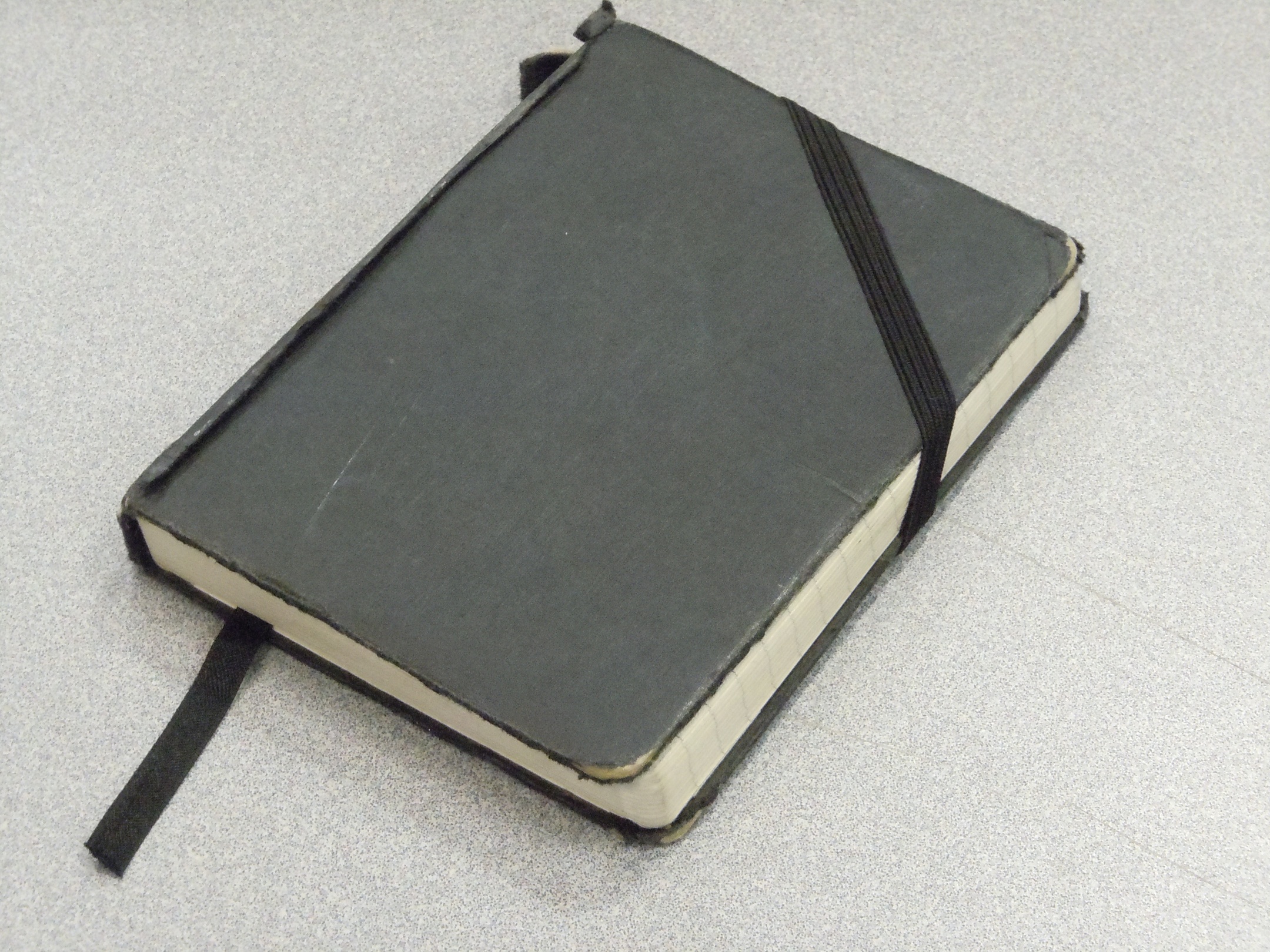
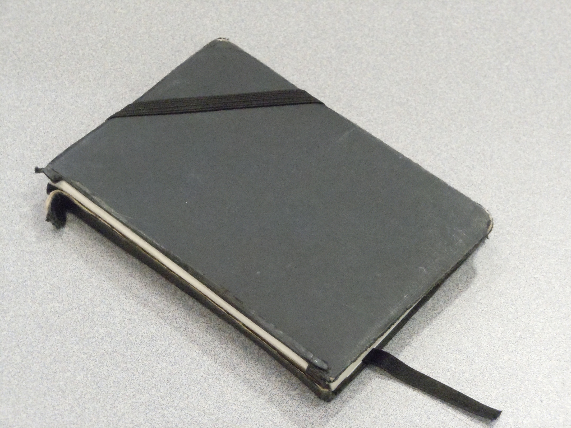
The most obvious difference between the Canteo and the Moleskine (or any number of notebooks with elastic enclosures) is that the Canteo’s enclosure keeps the notebook closed diagonally across the upper corner. At first glance it appeared that it might slip off accidentally, but that was never an issue. What did turn out to be problematic was the way the diagonal enclosure pulls on the spine of the notebook.
Basically, the elastic enclosure constantly tugs at the enclosure’s points of attachment. This is a given so long as there is tension on the elastic. With most notebooks the tension is parallel to the spine, so there is never any issue with it. In the case of a diagonal enclosure, there are lateral as well as vertical forces tugging unevenly at the spine of the notebook. The result is a skewed appearance that became apparent after a couple weeks of use.
The cover of the Canteo is a lovely black linen which holds wear well on the surface, but the edges fray easily, and on my model the edge of the spine came completely apart. This may not be an issue for someone keeping a journal in their desk, but for someone carrying the journal in a pocket or a backpack, the durability of the Canteo comes into question and I must recommend a more durable notebook.
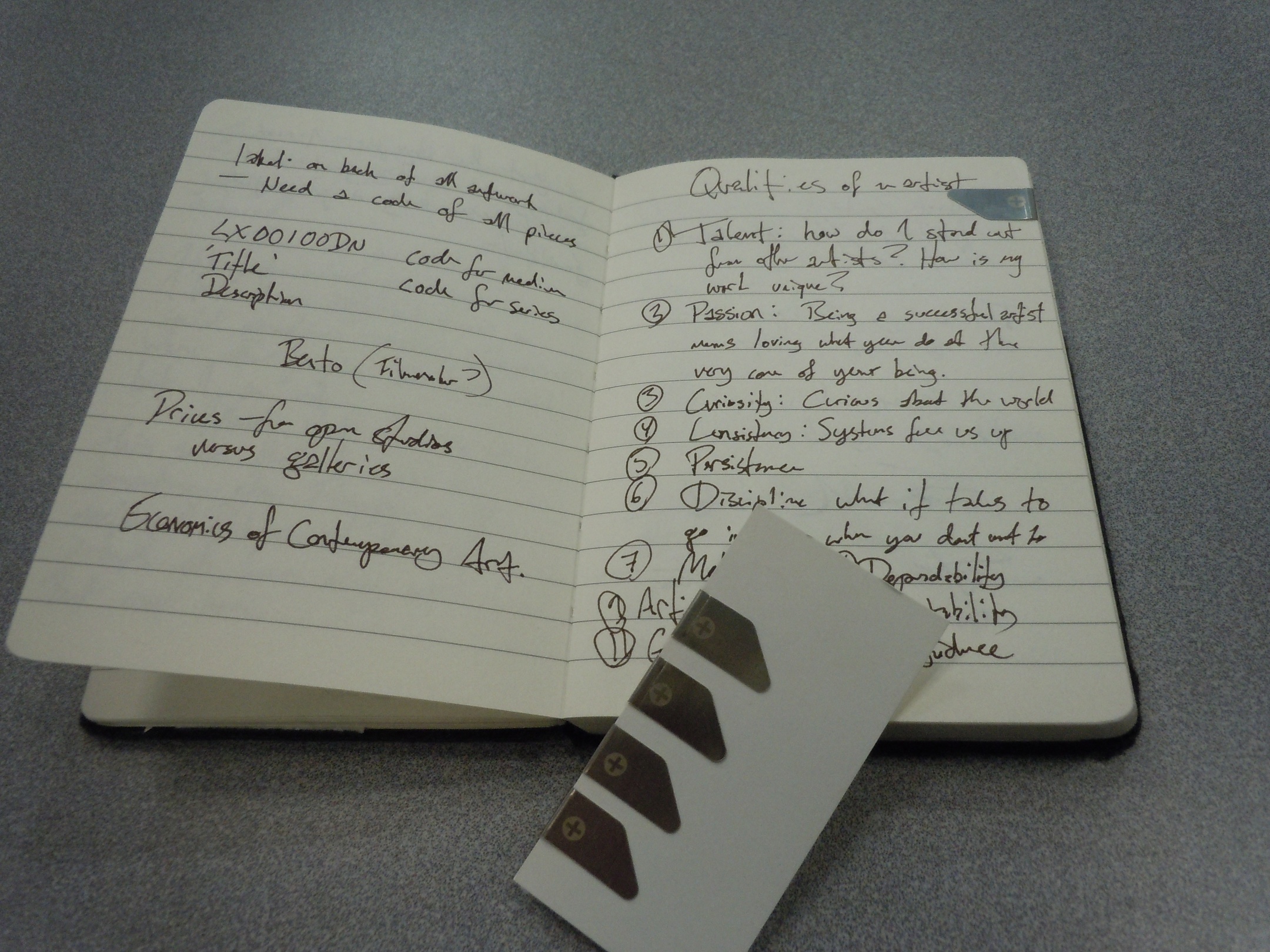
The paper itself proved to be of excellent quality: strong, durable paper with a smooth texture. I encountered no issues with feathering or bleedthrough using several wet fountain pen inks and a variety of nibs. The color is an off-white I might call eggshellnot as yellow as the cream color of a Moleskine’s pages, but enough off from white to alleviate eyestrain.
The ruling is an overly-generous 8mm. While it might work for the larger A5 notebooks, it was difficult to get a flow going with only a few words per line on the A6 (105 × 148mm) notebook. I know this is a personal preference, but especially on a small notebook, the spacing between lines should be more like 5 or 6mm. Those two or three millimeters make a huge difference.
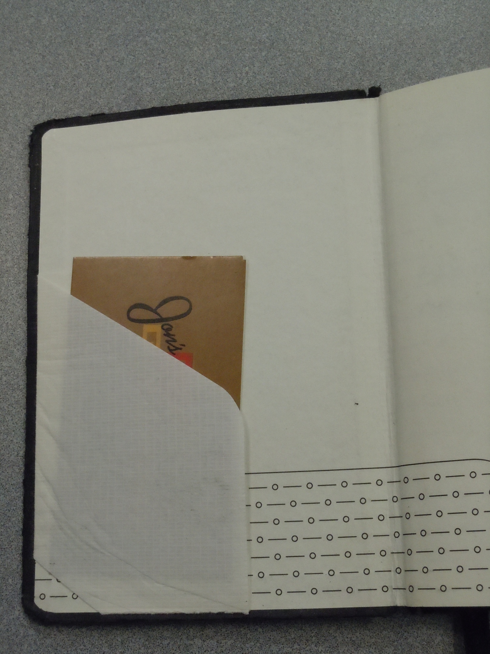
For extra features, we have a small diagonal sleeve inside the front cover. This is not much more than can fit a spare business card or two, but nonetheless more useful than including nothing. The traditional folder in the back cover wins by me.
One very nice feature (that I’ve reused with other notebooks) is the set of metal page tabs that Canteo included. These tabs clip on to a sheet of paper easily and snugly for easy re-access to particular pages. This approach is superior to the use of a cloth bookmark because it’s so easy to thumb directly to the page. The page tabs are best for often-referenced pages instead of keeping track of the most recently used page. For that, the included bookmark does the job.
If Canteo would make their bindings and covers more sturdy so that the notebooks could survive the stresses of the diagonal cover closure, they would have a great notebook on their hands.
