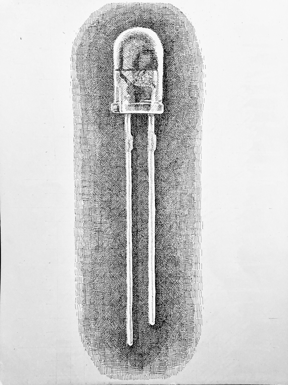
2DLED
Dipping a toe back into drawing with an illustration of a light emitting diode. I’ve been having some thoughts that I might use pen-and-ink illustrations in a basic electronics coursebook, so I gave it a try with a relatively easy subject. If this is going to be a series there’s a lot of work ahead of me, but it can start here and see where it goes.
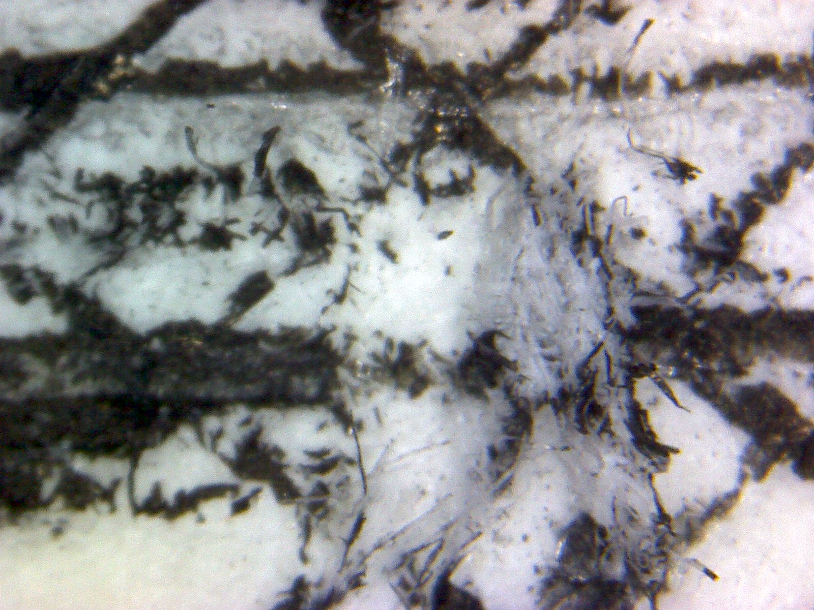
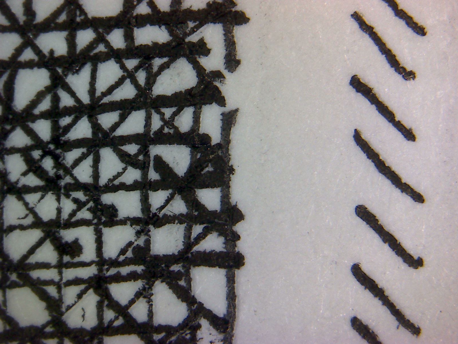
A drawing like this really isn’t very challenging. There aren’t a lot of surfaces or textures that need to be reproduced. There are the small details of the anode and cathode, which in a piece almost fourteen inches tall aren’t small details at all. Beyond that there’s just a lot of crosshatching to create the negative space. The hatching was tedious but not challenging; it’s just a matter of adding layers until it looks like tone.
In the past I loved my 6×0 (0.13mm) rapidographs. Maybe it’s just because the paper is old but all they seemed to do was tear the paper. This was a drawing at reasonably large scale, so I worked mostly with the 0 (0.35mm) and 000 (0.25mm). I did fill the 1 (0.7mm) and put down a line at the base of the casing. That felt like a mistake so I didn’t do anymore outlining.
I often like to outline figures to make them stand out against the ground; that’s one of the techniques that make me think of a drawing as a drawing. In this case I liked going for the softer treatment where the lines are suggested rather than overt. Neither approach is right or wrong, but they do create a different effect.
Putting down tone (or the illusion of tone) with hatching often feels a bit like painting. I lay down areas a bit at a time and layer them over one another. After a few layers when I ‘m looking close it can be hard to keep track of where I’ve worked and where I haven’t. I need to pull away and look from some distance (even arms length is adequate) in order to see the difference in tone.
I had some trouble with the ink flowing in the pens. They were cleaned before they were put away but the ink is old. All of my ink is more than ten years old. I’m working with the Rotring Rapidographs, which use a cartridge for the ink. From what little I know, the ink can go bad faster in a cartridge than in a bottle. I don’t know if that’s true or just legend, and I don’t really know what it means for ink to go bad.
That said, one of the cartridges went dry in the course of this drawing. That’s a lot faster than I’ve seen ink get consumed in the past, so I’m open to the idea that the cartridges were just too old. I’m thinking about testing different kind of technical pen inks. I have a few different kinds in my Amazon shopping cart with that purpose in mind. I think I have to give it a little more thought before I actually order them. I’m not sure how I would go about testing them, and what features I’d want to compare. I ought to have a plan before spending the money on four different kinds of black ink.
I have at least four different kinds of black fountain pen ink already — I might have as many as ten black inks. Rapidographs (or Isographs in the case of the Rotrings) take india ink, which should never be put into a fountain pen unless it’s one specifically designed for india inks.
Comparing inks is a topic for another day. For today, I finished this drawing, which had been sitting unfinished for more than a month. If I’d let it go much longer I might never have finished it. I didn’t take a close account of the time, but my guess is that this was about six hours’ work, spread across two evenings and one Saturday morning.