Das Keyboard: feel the noise

It seems a lit­tle strange to refer to Das Key­board as «the Das Key­board» because of course «das» means «the». It’s some­thing like ask­ing for the «hot sal­sa picante sauce», except that «key­board» is not Ger­man for «key­board», plac­ing Das Key­board firm­ly in the realm of brand­ing. Das Key­board isn’t even made by a Ger­man com­pa­ny — the key­boards are man­u­fac­tured in Tai­wan and they are designed and sold by a com­pa­ny in Austin Texas.1

This is per­haps a … Read the rest

What if your grail leaked?

Reg­u­lar read­ers of Mono­chro­mat­ic Out­look may recall men­tion of the Water­man Edson Dia­mond Black foun­tain pen. It was the pen I want­ed dear­ly but thought I would nev­er own because it was indeed too dear. At a MSRP of an even thou­sand dol­lars, its love­ly plat­inum trim and inset nib seemed out of my reach.

I had a chance to write with one at the Flax pen fair, and its smooth writ­ing cement­ed its place as the pen that I … Read the rest

What happens when I don’t pencil first

Philz MugOn Foun­tain Pen Net­work there is a top­ic start­ed by the user watch_art (also known as the print­mak­er Shawn New­ton) who called for draw­ings of cof­fee mugs. The one rule he stat­ed was that the draw­ing be done with each per­son­’s favorite pen.

Well, I’m not real­ly sure which pen is my favorite, but I know which foun­tain pens I’ve most enjoyed draw­ing with so I opened up my sketch­book and set myself up with my Philz Cof­fee… Read the rest

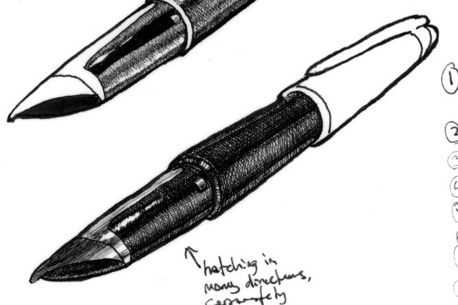
Early Stage Edson

Some of you have seen this fin­ished piece, but as I’m open­ing up my in-progress scans for pub­lic con­sump­tion, this is one that grabs me for a cou­ple of dif­fer­ent rea­sons. First, I’m very proud that the first lay­er of hatch­ing was all arcs to sug­gest the shape of the pen. Hav­ing that down first helped me move for­ward with a sense of dimen­sion that I don’t always have when I’m putting lay­er over lay­er of cross­ing lines down on paper.… Read the rest

Falcon Stage Four or It Was A Dark and Stormy Nib

Falcon 4At this stage, I’m not nec­es­sar­i­ly done with the nib, but I’ve pro­gressed far enough to be real­ly cau­tious about doing any more that I already have. It’s time for me to turn my atten­tions to oth­er areas. The end of the sec­tion is going to take a lot of ink, and I’m start­ing to have to get real seri­ous about final­iz­ing my com­po­si­tion. I have the basics in mind, but I’m weigh­ing out some deci­sions and solu­tions that are … Read the rest

Chapter Three, Custom 742 Falcon Drawing

Falcon 3Jump­ing ahead sev­er­al lay­ers, now there’s more tone and the appear­ance of con­tour. The nib of the pen still needs more con­trast to make it look shiny. By now, I’ve stopped using the 0.13mm pen exclu­sive­ly and have begun mak­ing some lay­ers with the 0.18mm pen.

There are two issues with con­tin­u­ing to use the fin­er pen. First is the fact that the more ink goes down on the page, the less blank space … Read the rest

More Sketchbook Pens: Four Edsons

Edson DraftThese are now past­ed into my sketch­book, but are not actu­al­ly sketch­book work, but drafts. I’ve men­tioned this before, but often what I do when I’m not cer­tain how to pro­ceed with a draw­ing is to place vel­lum over the pen­cil draw­ing and take dif­fer­ent approach­es at ren­der­ing the sec­tion in ink. Some­times these come out as almost ful­ly-real­ized draw­ings and oth­er times I’ll work only on one the area of the draw­ing. Some­times I’ll rough out some ideas crude­ly … Read the rest

Second Stage of Falcon Inks

Falcon 2Here you can see that after addi­tion­al lay­ers the hatch­ing begins to take on a smoother appear­ance. I’m deep­en­ing up some areas to give shape, but it’s a process that will have to devel­op over time. The blown-out high­light areas still look like paint­ed-on stripes and there’s lit­tle reflec­tive detail, but you can see where it’s going. The main sur­face of the nib still has only two lay­ers of hatching.… Read the rest